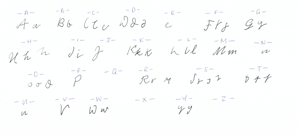
The editorial group was keen to include some pieces of Woolf’s handwriting for section titles so Woolf’s handwriting had to be replicated in some way to allow for the creation of new words. The only solution was for Katy to research Woolf’s letters, drawing a letter-bank of each character. This proved tricky because Woolf did not always form her letters in the same way – there are several types of ‘e’, for example, in her writing. Somehow, Katy managed to produce the most consistent letter-forms which she could use as the digital base. From there, it was a matter of creating each word, letter by letter, all represented in the exact shade of ink that Woolf favoured.
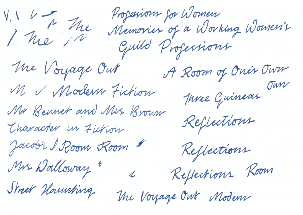
We now have what looks to be an identical rendering of Woolf’s own script (with the added advantage of legibility!). Katy Smith comments on the value of our meetings and conversations:
The [student] editors have brought fresh ideas to the design because they see each of my concepts with a fresh set of eyes. Whereas I tend to look very deeply into the details of each page, they see the book as a whole and generate exciting and innovative suggestions which I can bring to life.