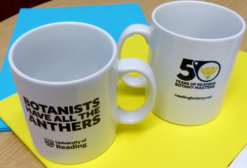
If you wish to purchase any of our specially designed Reading Botany 2019 merchandise please email j.mitchley@reading.ac.uk, NB prices excl P&P. Read about the design of our striking buttercup logo below.
THE STORY OF THE BUTTERCUP LOGO!
1. The need for a logo
When we first mooted the concept of Reading Botany 2019 back in the early part of 2018, we knew we needed a logo. We knew we needed a logo but what we didn’t know was how long and tortuous would be process of arriving with a logo fit for purpose. The good news is we did arrive and in time!
The logo needed to promote our celebrations include a series of botanically themed events starting in February with Botanical University Challenge and culminating in November with a symposium on the state of botany teaching in the UK, and a children’s lecture on Christmas plants in December.
2. Early designs – the tangled bank
Starting in January 2018 we asked one of our artistic MSc Plant Diversity students to work up some ideas and and we worked with an undergraduate student from the University of Reading typography department. We had a number of suggestions, one was based on a plant with strong Reading connections Blandfordia as the genus name honours the Marquis of Blandford who owned Whiteknights Estate which is now the campus of the University of Reading.
![]()
We also had a logo idea which was very much like Darwin’s tangled bank, very aesthetically lovely but really too elaborate for a logo! We also played with the idea of plant diversity including a range of plant taxonomic groups – mosses and liverworts, ferns, Gymnosperms and Angiosperms. At this point (March 2018) we had ideas all of them would look good on a T-shirt but all of them too complicated for a logo which above all needs clarity of purpose and statement. Clearly we needed a change of direction, but which way and where to?
3. A Change of direction – the buttercup breakthrough
At some point probably at the end of May 2018 we moved from these beautiful but complex designs to think about something much simpler. It was Dr Alastair Culham who first suggested we might incorporate the concept of someone looking at a buttercup through a hand-lens. This simple idea resonated with us because the hand-lens is an iconic tool of the trade of the field botanist and it is field botany we are at least partly celebrating with Reading Botany 2019.
![]()
The idea at that point was to have a Leonardo Da Vinci style silhouette outline of figure plus lens plus flower – no pressure for the designer there then! This is when in June 2018 we approached Tim Cantrell a fairly local designer/photographer and relative of one of our botany group. He suggested that the Da Vinci idea was too problematic and instead came up with the simple idea of buttercup and magnifying glass fused into the “G” in Reading University. This was a breakthrough! There was a lot of effort spent getting the sepals right. The buttercup in question is Ranunculus bulbosus – Bulbous Buttercup, it has characteristic reflexed sepals (this means the green bits below the petals are bent downwards!). Botanically speaking it was very important to get this just right and was quite a slog for our designer! We were very pleased with the end result, and there seemed now a very bright (even buttercup yellow) light at the end of our logo tunnel! But we could not use the logo it as it stood because it was not on the University of Reading branding, so we weren’t there yet, there was still work to do!
4. The final straight – hand-lens and buttercup
By now it was summer time and we were busy with grant proposals, student projects and all kinds of other things and so there was quite a delay. It wasn’t until around September 2018 when we showed the magnifying glass logo to Chris Bellis, one of the University of Reading designers, and he adapted it to the University brand. We liked the clarity of his design and we decided to shift from the magnifying glass back to the hand lens idea and thus on 27th September approximately 8 months after our initial logo discussions, the Reading Botany 2019 hand-lens and buttercup logo was born!
We find our logo works well in the original colour scheme – black, yellow and green – but equally well – white, yellow and green – on our sky-blue background as well as plain black and white.
![]()