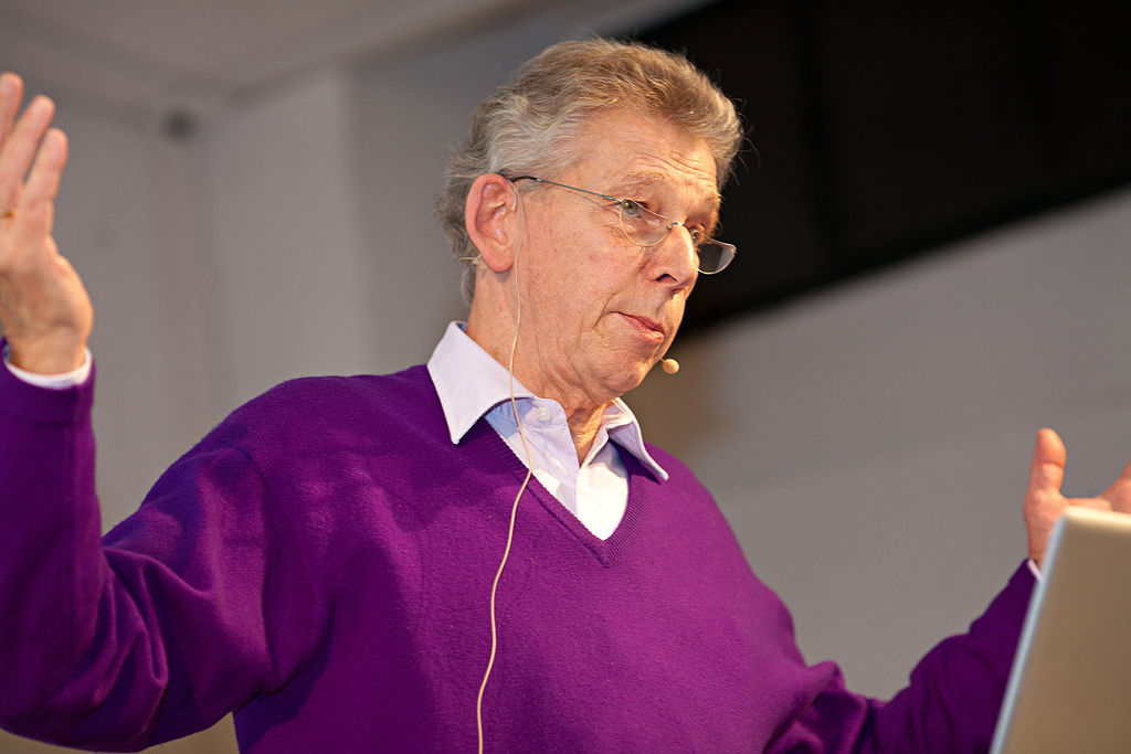
The late Gerard Unger was a renowned Reading typographer who designed typefaces that are used all over the world – from our very own University logo to the pages of newspapers. He was interested not only in letterforms but in the act of reading itself. Here his former colleague Christopher Burke reflects on his career and legacy.
Gerard Unger, who died in November 2018, served for 25 years as Professor in the Department of Typography & Graphic Communication at the University of Reading.
By the time Gerard joined the University in 1993, he had already established a reputation as a designer of typefaces for the new technologies of digital typography, which developed rapidly during the 1970s and 1980s.


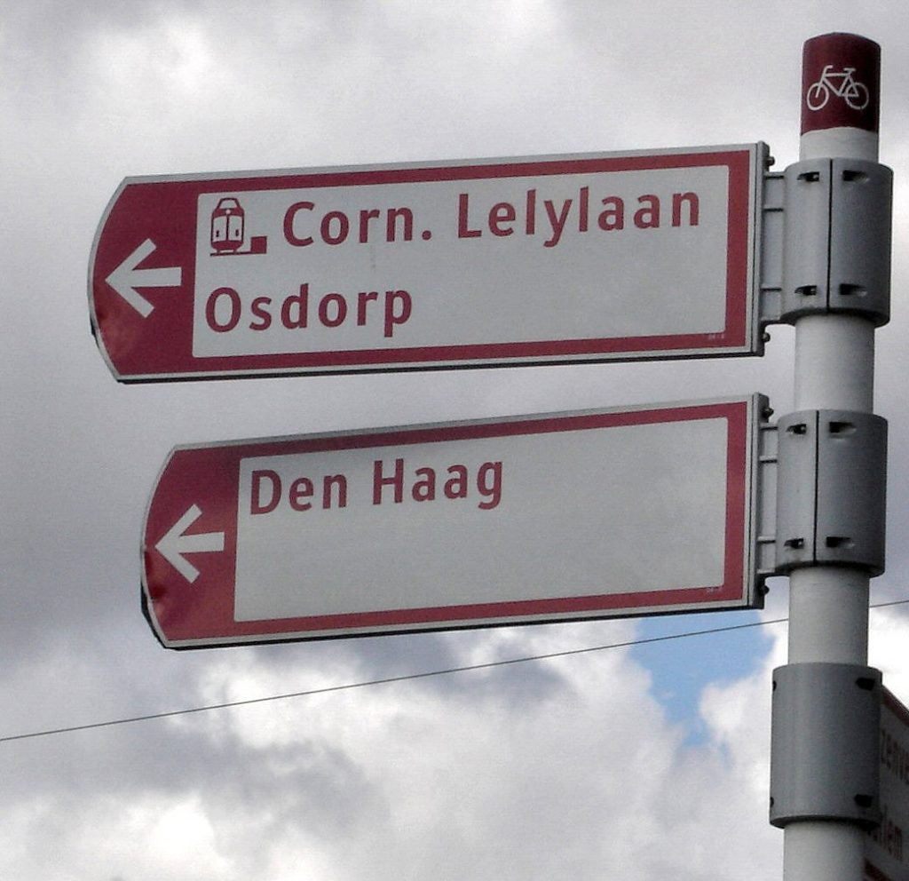
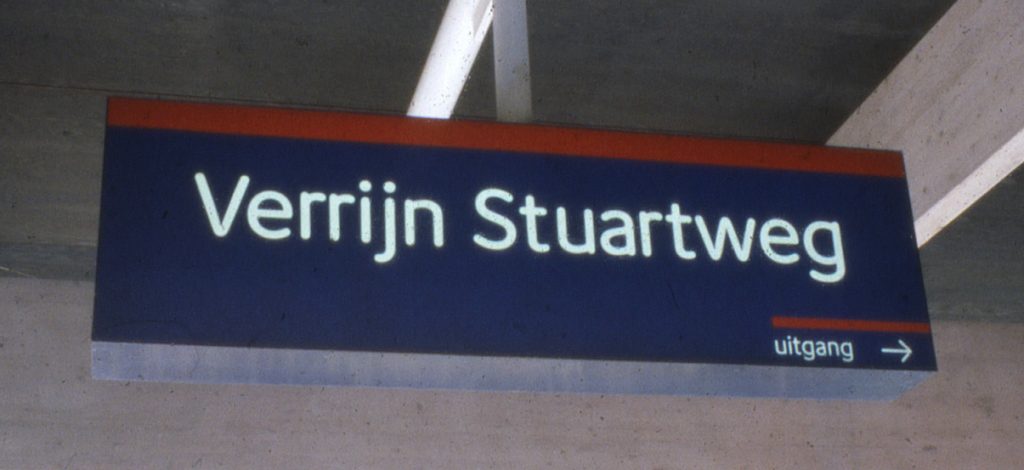
His designs include Swift (above), his best-known typeface, and Gulliver – so called because it appears bigger than it is – which appeared in the pages of USA today newspaper for ten years. His design is an everyday sight for University of Reading staff and students because his Vesta typeface is used on the University logo. Unusually among type designers, he was always eager to write about his craft and the challenges that new technology presented.
What happens when we read?
Gerard had taught graphic design part-time for many years at the Gerrit Rietveld Academie in Amsterdam, and was pleased to enter a different kind of academic context at Reading, which offered him a stimulating milieu for research. In particular, he took the opportunity to seriously investigate a question that had preoccupied him for many years: ‘what happens when we read’?
As a designer of the basic, graphic elements necessary for reading – letterforms – he was intrigued about the mental process whereby most people seemingly look through letters in order to access the meaning of words and sentences.
During his frequent teaching visits to Reading from his base in the Netherlands, Gerard would take advantage of late opening hours at Reading University Library to investigate subjects such as neurology and cognitive psychology. This research resulted in his book Terwijl je leest (1997), which has been translated into seven languages (including the English, While you’re reading).
Subconscious knowledge
The book is an eloquent weaving together of scientific knowledge about reading with considered reflections on type design. In it, he wrote:
‘Of all the things we use every day, letters must surely be the ones we most often use unconsciously. Most people use them both intensively and intimately, so it seems probable that readers possess a considerable hidden treasure chest of typographic knowledge. The vast majority of us have no conscious access to this, even though it is in fact accessed every time we read.’
Gerard investigated to what extent the act of reading can be analysed and understood, and how this knowledge can assist the work of a type designer.
Legibility research was naturally an important part of this research, but he rejected a view of reading as mechanistic, as solely about information transfer; instead he viewed it as a ‘multifaceted cultural activity’. This approach informed his lectures and personal design tutorials for the MA Typeface Design at Reading.
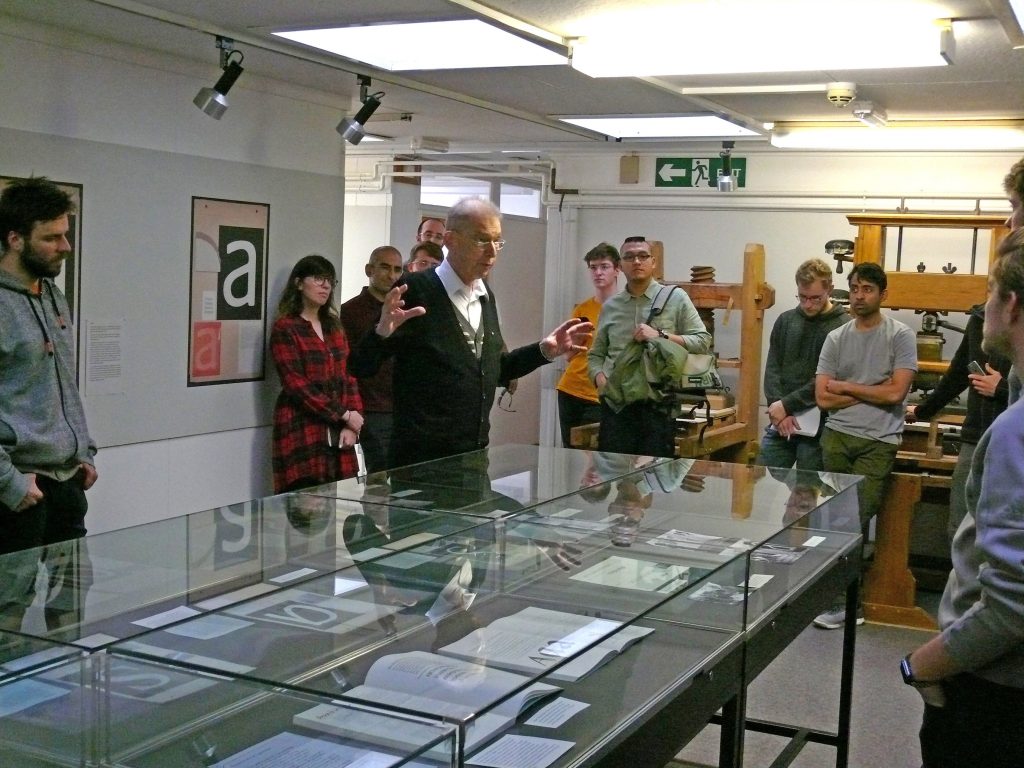
A bold legacy
Gerard was diagnosed with cancer in 2016 and, as a kind of ‘survival project’, he determined to write a final book, which he boldly named Theory of type design.
With remarkable fortitude during his illness, he finished this book and it was published shortly before his death. Its first printing sold out within a matter of months and it serves as a fitting testament to a leading type designer who also sought to make typography a matter of public discourse.
Gerard Unger was born in Arnhem, Netherlands, in 1942 and died on 23 November 2018. He was Visiting Professor of Typography and Graphic Communication at Reading and also Professor of Typography at Leiden University in the Netherlands from 2006 – 2012, after which he gained his PhD there on the subject of Alverata. During his career he designed stamps, coins, magazines, newspapers, books, logos, corporate identities, annual reports and many typefaces. His work was recognised with several prizes including the H.N.Werkman-Prize and the Sota-Award.