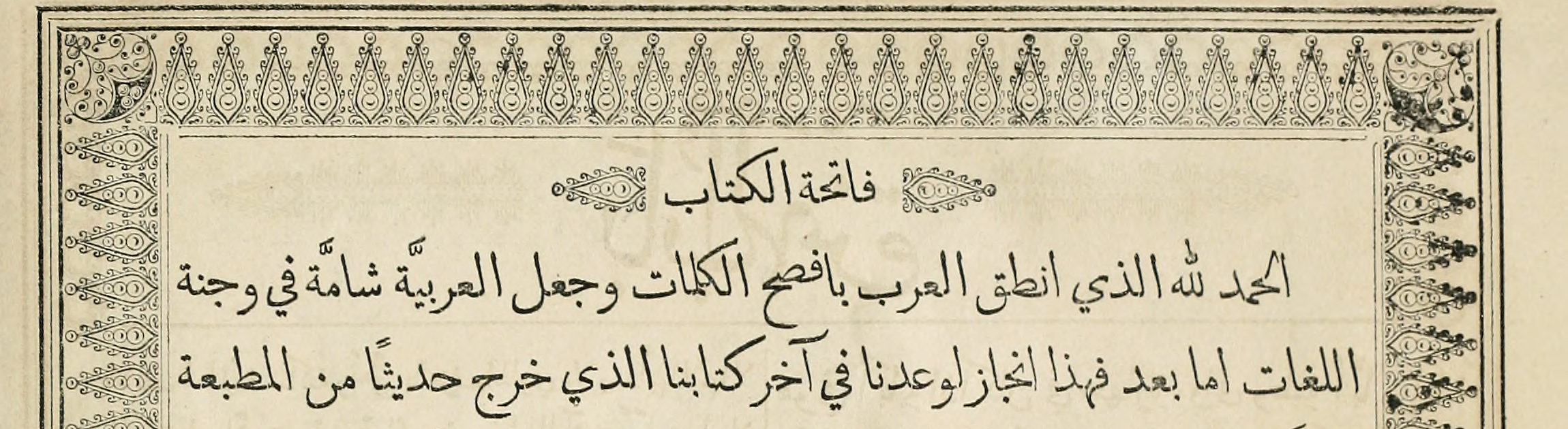
When creating a document with text in the Arabic script on a computer, the process is all but identical to the one for a Latin script text. There is a rectangular text area, usually defined by margins, that is filled with text, just like a basin is filled with water. Subject to the features of the software that I use for creating and viewing my new document, there are some options and requirements for Arabic text: It needs to run from right to left, letters are joined automatically at the right places, and sometimes I can choose a dictionary for one of the languages using the Arabic script, providing additional functionality. Values like the typeface, the font size, the default interlinear space, margins etc. are usually inherited from the Latin script, for which the software was originally designed. Indeed, the differences appear marginal between the typography produced by page layout software for the two scripts, and one could easily get the impression that substituting the letter shapes is all it takes to design an Arabic document.
If that is so, what is it that distinguishes the typography of Arabic from the typography of Latin, Greek, or Hebrew? And what is it that makes it specific? Are there any structural differences beyond the individual letter shapes that are arranged in rows? Asked differently, what is it that you have to know to be able to practise Arabic typography? Is there more to it than selecting the right-to-left text option and an Arabic font? How are columns justified, how many characters per line are readable, how is textual emphasis differentiated, and what are navigational aids in Arabic typography like? Are there any gauges for the quality of the resulting work, and can this quality be described?
TypoArabic takes these and other questions as its starting point. It is designed as a three-year research project funded by the EU Commission within the Horizon 2020 scheme, and it is hosted by the Department of Typography & Graphic Communication at the University of Reading, UK. TypoArabic is run by Dr Titus Nemeth as Principal Researcher, supervised by Associate Professor Gerry Leonidas, and supported by Professor Fiona Ross as mentor.
Typography for reading transcends time
But where and how could one find answers to the questions outlined above? In which context, and under what specific circumstances can Arabic typography reasonably be seen as embodying quintessential characteristics? Characteristics that transcend stylistic experimentation, personal expressivity, technical limitations, the aesthetics of an era and a place, and display a maximum of functionality and usability?
Whereas some residue of origin can never be fully avoided, it stands to reason that there are typographic traits that retain validity beyond their time, place, and mode of making. Fundamental aspects that define the functionality of typography are by definition detached from their historical context, and may thus inform contemporary and future practice alike. To name but one example, the ideal ratio of line length to interlinear space is not bound to a medium, a style, or an era, as demonstrated by the challenges in making texts readable on hand-held devices.
Identifying such timeless traits in historical practice rests upon an understanding of their origin. When reviewing a piece of typography, one needs a firm grasp of the context from which it emerged in order to avoid misguided conclusions. Taking a particular feature as evidence of intent, when it could equally well be explained by pragmatic necessity, is a typical trap that historians of print are facing. So how do we know which aspects are done deliberately, and which are reflecting constraints that were not intended?
Applied practice and historical research show that the material conditions of typographic production – principally of economic and technological kinds – largely determine its results.[1] The means and conditions in which typography is practised enable or curtail the scope of its evolution, and pragmatic considerations are the one preeminent determining factor in the making of documents. In the vast majority of cases, print served ulterior ends, and ‘design decisions’ can best be accounted for with technical and economic constraints. Incidentally, from this understanding also follows that different conditions favoured specific developments, and that some historical settings allowed for the emergence of particularly suitable solutions for certain requirements.
In the European context, in the 15th and 16th century typography for reading developed in forms that maintained their principal validity and functionality to the present day. Books printed during the first century of letterpress printing are as comfortably readable today as they were when they came fresh from the press. Central design considerations such as the format of the document, the size of the margins, the width of the column(s), the size of the type, and the space between lines of type, have barely changed from the first days of Western letterpress printing. The most generally useful and comfortable dimensions, spatial relationships, proportions, and organisational elements have largely been explored and defined over the first hundred years of European typography, and can still be used without alteration today. Central concepts of Western document design like textual hierarchies, visual emphasis, page numbers, running headers, indices, and many other elements that have defined the appearance of texts from the book to today’s device screens were either invented or canonised by the first few generations of printers in Europe.[2]
The ‘Arabic incunabula period’
If we look at the history of typography in the Arabic script world, the differences to the European experience are obvious, and the muted reception of letterpress printing for roughly four hundred years is central. Although typography was known and practised in the Islamic world by Christians and Jews, Muslims displayed no interest in using it for the Arabic script for almost 300 years. A sustained and large-scale use of letterpress printing in Arabic only began to take off in the 1840s, some 400 years after the foundations for Western print culture were laid in Europe. This time frame alone, and the fact that typography was a technology imported from the West, demonstrate the profound differences between the European and the Islamic experience of typography.
Yet irrespective of these differences, when looking for a model of Arabic typography for reading that transcends style, expression, and technical limitations, a parallel emerges to the history of typography in Europe. For when printers, punchcutters and type founders in the Arabic script world embraced letterpress printing, and print publishing began to flourish for the first time, the resulting typography was exemplary. Theirs were not the first typographic Arabic books, as these were produced in Europe from the early 16th century. Yet the European letterpress prints largely remained an academic exercise, useful and successful only for a small number of Western scholars, who often were at the same time the client and the maker of printed Arabic books. In the rare occasions when Arabic prints were exported to the Middle East, it appears as if they had no success at all, and the disinterest in the technology itself demonstrates that European Arabic typography lacked persuasiveness for native readers. These early Arabic printing endeavours remained self-contained experiments of an intellectual and economical elite. They did not have the character of a mass medium, nor the features to make them a model to follow.
By contrast, when Middle Eastern craftspeople took up the techniques of letterpress printing in the mid-nineteenth century, their ambition was to reach as many buyers from the region’s growing readership as possible. To achieve this, they had to ascertain that the documents coming from their presses met the standards and expectations shaped by a sophisticated manuscript culture. As in other changes of technology that delivered the same product using different means, Middle Eastern printers of the mid-nineteenth century sought to upset readers’ habits as little as possible. They knew that a printed book that diverged substantially from the norms that their prospective clients expected would not be bought, jeopardising their investment.
Indeed, it comes as no surprise that a pillar of the establishment of printing in the Middle East were private commissions. As Kathryn Schwartz demonstrates, the model of commissioning was carried over from the manuscript age, yet introduced a considerable new economic risk.[3] Since large quantities of paper had to be used for a printed edition, and more labour was involved than in the case of an individual copyist reproducing a single manuscript, substantial sums were at stake. The resulting risks were often shared by consortiums, and relieved the printer from this financial burden. Another strategy to reduce the economic risk was, of course, to issue texts whose popularity was well established. Thus, the continuity from manuscript culture to print culture in terms of the titles that were published probably relates to straight business concerns as much as anything else.
Undoubtedly, economic interest was a key driver for the private pioneers of the trade, as reflected in a veritable ‘startup culture’. Within a relatively short time span countless presses emerged in the publishing hubs of the region: Beirut, Cairo and Istanbul. Enterprising individuals like Musa Kastali, Khalil Sarkīs, and Ohannis Mühendisyan recognised the opportunities that emerged in a changing societal landscape, and tried to make a living within a promising evolving trade. There was, however, no guarantee for success. The volatility of this field, and the uncertainty of individual endeavours during this era is confirmed by the fact that most presses ended as failures, having only published a handful of titles before vanishing again.
Whilst private presses with an economic agenda were not the earliest pioneers of the trade, the other central drivers of print in the Middle East, government and mission presses, also had to work hard for their output to be read. Propaganda, whether it was political or religious, was pointless if it was not absorbed by the audience – a lesson that was learned the hard way by the presses of the Church Missionary Society (CMS) and the American Board of Commissioners for Foreign Missions (ABCFM): Both institutions initially used English made Arabic type of questionable quality, and experienced that their intended audience was not willing to engage with documents that appeared entirely alien. For a text to be read without hesitation, it had to be as conventional as possible, especially so if it was made using unfamiliar means, and contained strange or unfamiliar content. Documents had to appear familiar, and had to be easily readable – in form and content – to stand any chance to proselytise.
In the nineteenth century Middle East, Arabic typography thus had to perform on a number of levels: it had to convince an audience that was overwhelmingly used to the appearance of manuscripts; it had to be economically viable for the pioneering printers to survive; it had to achieve everything that a manuscript could do, yet translate it to a new medium; it had to find solutions to the specific requirements of the medium which had no precedent in manuscripts. In consequence, Arabic typography of this period was made to be as functional, pragmatic, and essential as possible to fulfil its central task: to convey written language in a way that was clear and unambiguous, pleasant to the eye, efficiently absorbed, and produced in more copies than were ever made before. It was no-nonsense Arabic typography for reading, and it was designed with the typographic technology of the day: letterpress printing.
The technical conditions
The techniques and processes of letterpress printing had changed little since the fifteenth century, and the adoption of this craft at a late stage of its life-cycle was important for its success in the Arabic-script world. Manual type founding was a fully matured technology that could be imported and adapted to local needs and circumstances. Whilst conceived and developed in Europe around the properties of the Latin script (and to a lesser degree Greek and Cyrillic scripts), the very fact that it was manual type-founding and composition provided a considerable degree of flexibility. First of all, the number of sorts that a font of type contained was open, and could be extended as the need arose. When a printer required a letterform that was not included, he could make or commission the specific sort that he needed. Furthermore, the way in which sorts were composed was not entirely predetermined. Although a tendency to organise the forms of a script in rectangular, similarly sized modules that were aligned along a horizontal baseline was inherent in foundry type, there was no strict necessity to adhere to this concept. The repertoire of type-making techniques contained numerous instances in which type founders had gone beyond the conventional, orthogonal grid: there were sorts with wide overhanging kerns, both vertical and horizontal as found in some early Greek types, which de-facto circumvented the rectilinear arrangement;[4] there were instances of Italic fonts that employed diagonal sorts; and there were various cases in which multiple sorts were combined in an interlocking compound to create new letterforms.[5]
As the Middle Eastern print revolution unfolded over the second half of the nineteenth century, the flexibility of this relatively open technique for the composition of type proved advantageous for Arabic as well. When type-makers familiar with the conventions and expectations of the Middle Eastern reading public embraced foundry type-making and letterpress printing, typefaces of hitherto inconceivable quality and aesthetic accomplishment were created.[6] Indeed, the possibilities of manual type-founding and composition were thrown into stark relief when type-making and setting were mechanised, and the provisions and limitations of machinery dictated a much narrower scope for the representation of scripts in type. From the invention of the Arabic Linotype machine, first installed in New York in 1911, Arabic typography was marked by excessive mechanical constraints, leaving their marks throughout most of the twentieth, and into the twenty-first century.[7]
A golden age
In view of the above, the decades from the 1840s to the eve of the first World War appear as a unique window of opportunity for the emergence of Arabic typography that was not determined by inadequate technical means. Foundry type in the hands of craftspeople who had a high level of competence in the characteristics of the script, who were familiar with the norms and conventions of Islamic manuscript practice, produced exemplary Arabic typography for reading, and their products resonated with their audience. Print culture evolved and became established throughout the Middle East within a few generations. Whereas in 1800 Arabic print was still an exceptional, marginal medium, by the end of the century it had touched all strata of society, and spread into most corners of the region. During this era, new genres of texts and publications – newspapers and magazines to name but two – emerged, and attained their appearance as typographic documents, rather than manuscripts. At the same time genres that had established manuscript precursors such as novels, dictionaries, and religious works were translated into printed formats, and were given shape using typography, whilst printed ephemera began to saturate everyday life irrespective of the level of literacy.
In this historical context, TypoArabic seeks to investigate best practice in Arabic typography that retains significance for contemporary practice. It will investigate and analyse patterns and conventions as they emerged from the work of the first generations of Middle Eastern master printers. In lack of accounts of the trade, and a chain of transmission of the craft, it works with the best evidence of material culture: the artefacts that it produced. Using original sources from the publishing hubs of the nineteenth century Middle East, TypoArabic aims to identify how Arabic typography was practised when, for the first time, this medium was turned into a successful proposition for native readers. It seeks to understand the principles which were considered best practice by craftspeople who had learned their trade during the pinnacle of Ottoman scribal culture. Thus, TypoArabic will engage the material testimony of the first mass medium of the Arabic script world, and distill and translate its findings into a form that aspires to inform current practitioners and students alike.
This blog will be its mouthpiece.
[1] Martin J. Heijdra demonstrates the weight of economic factors in the case of Chinese movable type. He shows that contemporary cost calculations for different printing techniques correspond closely to the historical use of these techniques, indicating that 19th century printers in China were acutely aware of which technology suited their publishing project best, and in many cases it was xylography, rather than letterpress printing. “Technology, Culture and Economics: Movable Type versus Woodblock Printing in East Asia”, Studies of Publishing Culture in East Asia (2004): 223–240.
[2] Aspects of this pioneering thrust have recently been summarised by John Boardley in Typographic Firsts, Oxford: The Bodleian Press, 2019.
[3] Kathryn Schwartz, ‘The Political Economy of Private Printing in Cairo as told from a Commissioning Deal turned sour, 1871’, International Journal of Middle East Studies 49, no. 1 (2017): 25–45. doi:10.1017/S0020743816001124.
[4] See Nicolas Barker et al., Aldus Manutius and the Development of Greek Script and Type in the Fifteenth Century,, Chiswick Book Shop, 1985.
[5] In the 1830s the French Orientalist Jean-Pierre Guillaume Pauthier and the Parisian type founder Marcellin Legrand developed Chinese foundry type in which characters were divided into their recurring constituent parts, in an attempt to reduce the number of punches required to make a Chinese font. According to Thomas Mullaney, this effort was, however, bound to fail as the compromises necessary were too severe to produce a typeface that adhered to conventional proportions and canonised aesthetics. The Chinese Typewriter: A History, Cambridge MA & London: The MIT Press, 2018, pp. 89–103.
In Indian type founding the practice to cast vowels as separate sorts that combine with consonants was established by the second half of the 19th century. There were two documented techniques, the Degree and the Akhand system, well illustrated by B. S. Naik in his Typography of Devanagari (3 vols. Bombay: Directorate of Languages, 1971.). According to Fiona Ross a version of the degree system had been used as early as 1778 by Charles Wilkins, but was only fully developed in ‘1836 when an Indian named Thomas Graham cut the punches for a Marathi fount in the Devanagari script at the American Mission Press (Bombay)’. ‘Historical Technological Impacts on the Visual Representation of Language with Reference to South-Asian Typeforms’, Philological Encounters no. 3 (2018) 441–468, p.452.
[6] Emanuela Conidi’s PhD thesis charts the history of Arabic type-making from its European beginnings to the advent of mechanical typesetting, demonstrating the substantial advances that were made in the Middle East during the nineteenth century. ‘Arabic Types in Europe and the Middle East, 1514–1924: Challenges in the Adaptation of the Arabic Script from Written to Printed Form’, University of Reading, UK. February 2018.
[7] See my study Arabic Type-making in the Machine Age: The Influence of Technology on the Form of Arabic Type, 1908–1993, Leiden & New York: Brill, 2017. https://doi.org/10.1163/9789004349308