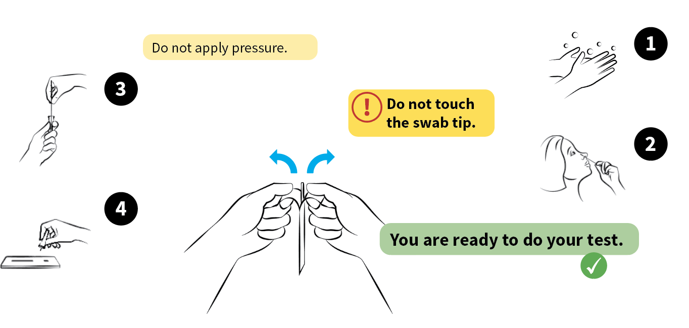
We asked members of our panel about versions of COVID Lateral Flow Test (LFT) instructions that showed differences in the use of colour, layout and emphasis.
We designed different versions for each and using an online survey, we showed these to members of our panel and asked them for their preference and to tell us why.
16 people participated (8 women, 7 men and 1 non-binary person), between 23 and 73 years old. There was a mix of frequent and occasional test users, but almost all of them (15/16) had taken a covid rapid test before.
What we learnt
- Visually enhanced test overviews were well received by our readers. Images, numbers and careful use of space are three effective ways to do this.
- Readers responded well to a high level of salience shown through yellow panels, bold type and symbols to highlight information that warrants a certain level of urgency.
- Emphasising headings through large type, use of numbers and a coloured band helped to separate the steps involved in doing the test.
- Our readers were positive about the use of colour to monitor their actions: green was used to convey confirmation, and yellow to convey precaution.
1. Salient elements: Headings and precautions
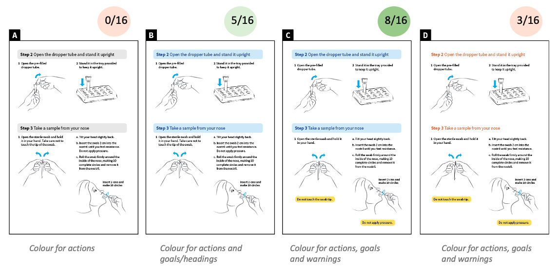
We wanted to understand whether precaution information enhanced with colour would distract from the headings, which also must be salient to help people to find their way in instructions.
We designed 4 versions of part of the instruction, combining different visual treatments for the headings (with and without colour background, in black and in colour) and precaution information (plain or enhanced in yellow).
Versions with headings with background in colour (B and C) were preferred, in particular the version combined with enhanced precautions. Colour background for headings was effective to help divide the page into meaningful sections.
2. Overview of the test
We wanted to understand whether different ways of drawing attention to a sequence of actions could be used to increase the usability of a test overview.
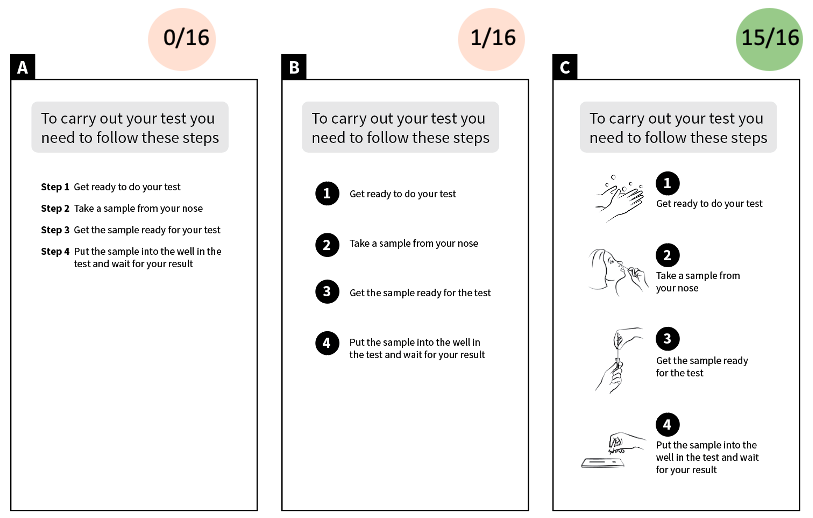
We presented one plain overview, and 2 enhanced versions, one with numbers and vertical space, and another with numbers, vertical space and diagrams.
Almost all participants preferred the third version, and comments suggested that this version was the most inclusive to audiences with varying eyesight, reading skill or special needs.
In this version, diagrams were used in an ‘indicative’ way (i.e. selected to represent the correspondent stage loosely), so we checked to see how this fitted with people’s expectations. The issue of specificity of the diagram did not come up, suggesting that our intention was understood by participants. One participant commented: ‘Visualisations allow me to “kind of know” what the point is before I even read it.’
3. Checking the test
- a version using vertical space to separate the steps,
- a version enhanced with colour to signal precaution (yellow) and reinforce things to look for (green).
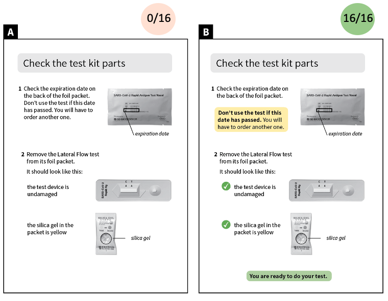
Preference for the version enhanced with colour was unanimous. We found that the use of colour to signal and reinforce ‘things to check’ was valued by all participants.
4. Precaution information
We explored reactions to different ways of presenting precaution information.
When asked about the function of the colour yellow, participants said it signalled crucial information to be followed in one set way, suggesting that the highlighting function was well understood. The words and phrases they used in open-ended questions are shown in this word cloud.

We also compared different approaches to indicate precautions:
- a plain approach (A) included the precaution in the action step text
- an enhanced version (B) separated the precautions with a yellow background
- an emphatic version (C) added bold text and a symbol
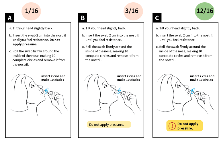
The emphatic version was preferred by most of our readers, suggesting that considerable visual emphasis can be given precautionary statements.
We were also interested in the nuanced character of each of the precautions, and whether this was important. Some readers distinguished nuances between ‘danger’, ‘personal precaution’, and some comments suggested that the graphic style we show in version C here is very linked to ‘danger’, but that the contents may not require such urgency.
Thank you to the members of our panel!

