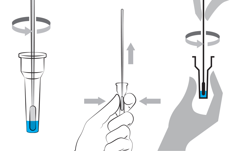
We asked members of our panel to give us feedback on a set of diagrams for Lateral Flow Tests for COVID-19. We showed them diagrams differing in the type of arrows used, drawing style and number of hands used.
We are exploring graphic approaches in diagrams for key action steps in COVID-19 tests using lateral flow tests (LFTs). In order to improve instructional diagrams for test’s instructions, we asked members of our panel to explain the meaning of a set of diagrams, and to tell us their preference between alternative approaches. 14 people participated (7 women and 7 men), who were between 27 and 81 years old.
In a survey, we showed them different versions of diagrams, in which we explored:
- Arrow style: the same action represented with arrows with different stems and tails
- Drawing styles: the same action represented in shaded, sketchy and iconic drawing styles
- Hands in diagrams: diagrams with no hands, one hand or two hands performing the action
We wanted to find out about the accuracy of different arrow styles to convey two different actions (rotation and squeeze), the appropriateness of different drawing styles for COVID-19 test instructions, and about the usefulness of hand depictions in instructional diagrams.
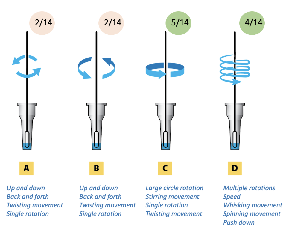
What we learnt about arrow style
- The arrow style can lead to interpretations about the type of motion (‘twist’, ‘stir’, ‘whisk’, ‘spin’), force applied, etc, but there is no conventional way to encode or interpret this.
- Stylistic choices for arrows affect how people think they should perform the action.
- The arrows drawn in perspective or in 3D were better to represent an action in a three-dimensional space.
- There was clear preference for alternatives with ghosted shapes. This suggested that this may be more a more effective way to communicate the action in the diagram.
Arrows for ‘Rotate the swab’. C and D were preferred over A and B. All the options conveyed a ‘rotation’ action overall, but while A and B could be interpreted as ‘up and down’ or ‘back and forth’, D had an added focus on multiple rotations.
Arrows for ‘Squeeze the tube’. There was a clear preference for B, which seemed to be the best for indicating movement. The arrow styles in B, C and D could be interpreted as saying something about the amount of force applied (more force than the others, or increasing force as you squeeze).
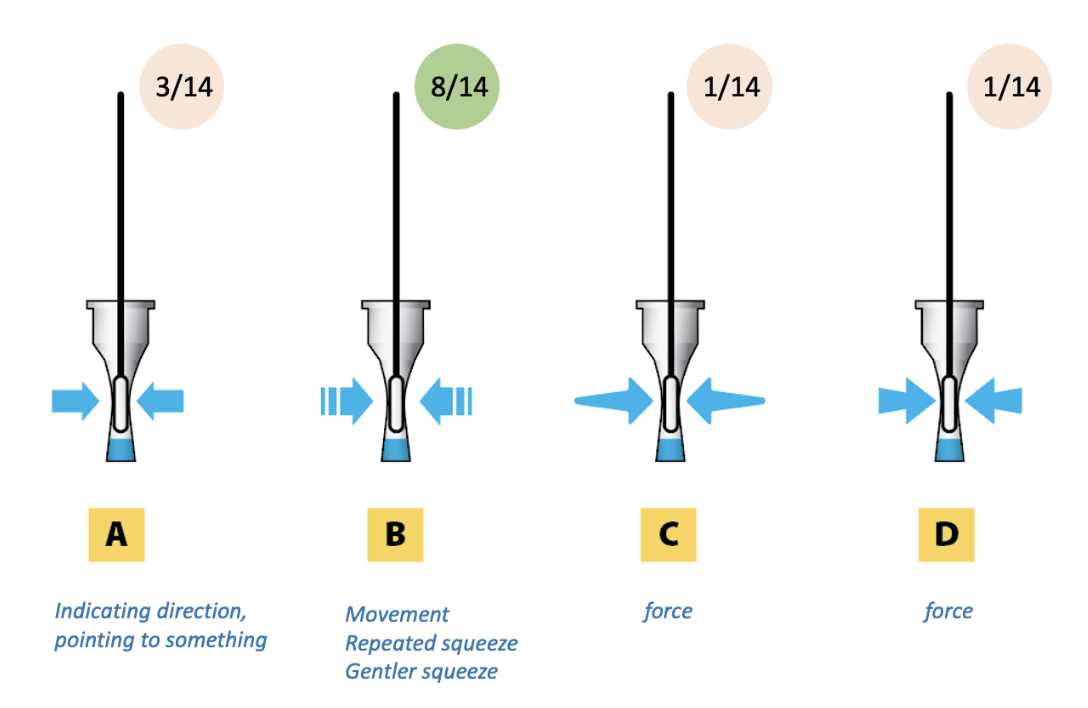
Ghosted shapes. 13/14 people preferred a diagram showing the swab in ghosted form.

What we learnt about drawing styles
- A linear style supports enough detail, while also being simple enough.
- The shading doesn’t seem to add valuable information for readers. Instead, it may clutter the illustration and give objects and unwanted appearance to readers.
- Although they may be visually striking, oversimplified illustrations fail to provide information about ‘how’ to perform the action. They may be useful to signal generic tasks that viewers are familiar with. However, users doing more specific actions, for example handling of kit parts, may require more detail.
Drawing styles. 12/14 people preferred a linear style.

What we learnt about hands in diagrams
- Including both hands in diagrams is an effective way to embody the action, and provide useful information for viewers.
- However, designers should consider that including 1 or 2 hands changes the scale at which the tube can be shown, and may worsen the legibility of the diagram.
Hands in diagrams. There was clear preference for diagrams with 2 hands (12/14).

Thank you to our panel members for your feedback!