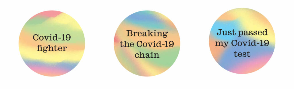
We worked with Fraser Muggeridge studio to explore the use of graphic patterns in shifting the narrative of COVID-19 testing.
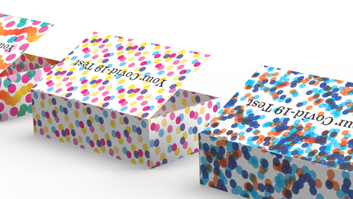
The ‘medical-looking’ test boxes look authoritative, and this clean look can support beliefs of effectiveness. However, it can also be daunting to do a test if it looks very medical and clinical.
Inspired by the work of the Festival Pattern Group created for the Festival of Britain in 1951, our creative partner explored graphic patterns combining colour and shape to make the packaging of a test kit less scary and more welcoming to users.

- Dots were selected for their versatility and open-ended meaning. In the COVID-19 / medical context, dots could be used to represent individuals, a microscopic view of cells, or the spread of the virus.
- Vibrant colours. The use of red was limited, because of its association to illness, and blue for its association to the medical world.