Dawn Kanter, Rachel Lewis and Chrissie Willis-Phillips [Digital Humanities Officer, Research Development Manager and Associate Director (Scholarship and Planning), DH Hub team] and Jo Stace [Designer, Creative & Print Services] discuss how we arrived at this new visual identity.
Dawn Kanter (DK): The Hub team first embarked on this branding project with three aims in mind. We wanted to help colleagues to recognise the Digital Humanities Hub; to tie the various things that the Hub is involved in (such as events, presentations and resources) together; and to tie ourselves more closely to the Library, where we are based.
After meeting with the Creative & Print Services team, we put together a list of keywords that could inform the imagery in our branding. These included ‘Digital Humanities’, ‘Arts and Humanities’, ‘Digital Technology’, ‘Interdisciplinarity’, ‘Research Innovation’, ‘Collaborative Research’, ‘Open Research’… I didn’t think that it would be easy to come up with designs based on these quite abstract terms! We were all very excited when we saw the initial concepts.
Jo Stace (JS): From the initial brief I knew that I wanted to create a graphical identifier – something that’s not exactly a logo, but that can be used to identify the Hub. It needed to be something that gave a sense of what the Hub does, but that also looked visually pleasing. This bespoke graphic could then be used across various materials to create a visual identity. I also thought it was important to find imagery that could be used by the Hub to give the feeling of data and digital technology. This process started with a search of our stock image library.
Additionally, some elements of the design needed to follow particular guidelines. The typography needed to fit within University branding, and the colours needed to come from the Library ‘rainbow’ branding to create a link between the Hub and the Library.

UoR Library branding
JS: With all this in mind I developed three initial concepts:
Concept 1 – Analogue to Digital: This took the idea of going from an analogue form to a digital form. I wanted to represent this with lines that start off ‘hand drawn’, then move into a precise digital shape which forms a circuitry graphic.
Concept 2 – Network and Nodes: For this concept I wanted to play on the idea of connection, both in terms of the Hub connecting people and their work, and the idea of data connection and digitalisation.
Concept 3 – Pixel Patterns: This third concept looked at using basic shapes to represent pixels (again focusing on the digital element of the Hub’s work), but creating a flow with the shapes to reflect the human nature of data.

Three concepts for graphical identifiers for the DH Hub
DK: The Network and Nodes concept was a favourite with the Hub team.
Rachel Lewis (RL): From the beginning, the Hub’s role has been as a focal point that connects lots of different people and teams. This design represents who we are and what we do.
DK: We also enjoyed the relationship between the Pixel Patterns and the Library’s rainbow block. So we asked Jo if we could proceed with both concepts (2. Network and Nodes and 3. Pixel Patterns).
JS: Once the two options had been chosen, I wanted to develop imagery to fit with the graphical element. It became clear that the images from the stock library were too dark for this project and sometimes too generic.
DK: We wanted to strike the right balance between specific (e.g. images of 3D-modelled objects or text markup) and general (e.g. abstract representations of technology).
JS: I felt that a more bespoke graphic was needed. Starting with stock images, I was able to manipulate these and introduce the Library colours. I then had a graphic that I could use across multiple assets, and which the Hub team could use to create a visual link between their work.
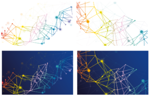 Custom imagery for the DH Hub
DK: This imagery that Jo designed matches the concept of ‘Hub’ or ‘Network and Nodes’ in the graphical identifier.
RL: It also has the look and feel of the output of social network analysis, so it ties in with DH research as a theme too.
DK: Looking at the graphics alongside the imagery, the Hub team chose to move forward with this Network and Nodes concept.
JS: From this point I was able to use mock-ups of how the visual identity would work on pull-up banners, leaflets, web banners and presentations.
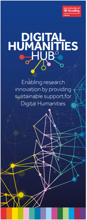
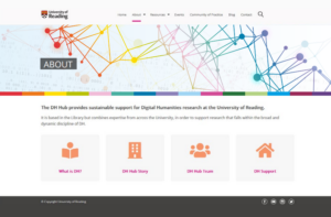
Mock-ups of a pull-up banner and web banner
DK: It was very exciting for the Hub team to see these mock-ups. Some of the designs also included a new idea: a handwritten text element (alongside the Network and Nodes motif), which reminded us of some of the primary sources that Digital Humanists might be using.
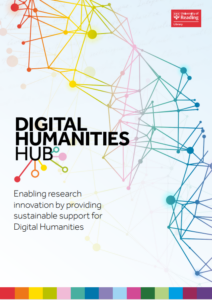
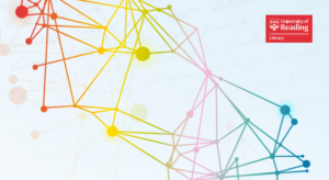
Left: Mock-up of a leaflet. Right: Zoom-in on handwritten text element in background
RL: I really liked the idea of including primary sources, and I suggested (as did Sue Egleton, University Librarian) using a manuscript from our own collections for this purpose – highlighting both the richness of our Special Collections and the Hub’s relationship with UMASCS (University Museums and Special Collections).
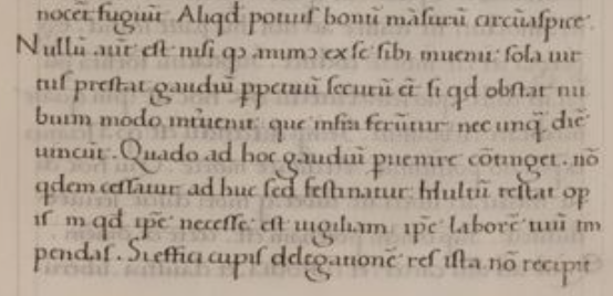
DK: Caroline Gould, UMASCS’ Principal Archivist, suggested a few different manuscripts that we might use. Taking into account its appearance, content, and rights restrictions, we chose this one, from (the Ancient Roman Stoic philosopher) Seneca’s Epistolae Morales ad Lucilium (Moral Letters to Lucilius). The manuscript was produced in Italy (or South Germany?), c.1475.
Including this in the branding was not straightforward! It initially took me some time to find the part of the text which is about joy (letter 27) as opposed to the part which is about death (letter 26). There is also a scribal error in the text itself, which we wanted to avoid. Many thanks to Rachel Mairs (Professor of Classics and Middle Eastern Studies) for reviewing the below.

Website banner incorporating the manuscript leaf
 ‘
‘
Manuscript leaf from Seneca (Epistolae Morales ad Lucilium), in Latin, produced in Italy (or South Germany?), c.1475 reference MS 5650/23, European Manuscripts Collections, Special Collections, University of Reading (detail)
‘Cast about rather for some good which will abide. But there can be no such good except as the soul discovers it for itself within itself. Virtue alone affords everlasting and peace-giving joy; even if some obstacle arise, it is but like an intervening cloud, which floats beneath the sun but never prevails against it. When will it be your lot to attain this joy? Thus far, you have indeed not been sluggish, but you must quicken your pace. Much toil remains; to confront it, you must yourself lavish all your waking hours, and all your efforts, if you wish the result to be accomplished. This matter cannot be delegated to someone else.’ Translation by Richard M. Gummere
DK: The branding exercise also prompted the Hub team to re-examine our tagline. We settled on ‘Enabling research innovation by providing sustainable support for Digital Humanities’. ‘Enabling research innovation’ is the motivation that underpins all that the Hub does, while ‘sustainable support’ means (to me) support that is integrated and embedded. For example, members of the Hub team are involved in the grant development process and in decisions about digital infrastructure.
RL: One of the strands of the original DH Hub setup project was about sustainability, so we’ve built a sustainable service from the start. Enabling sustainable research is key to everything that Robert Darby and Guy Baxter, in the Hub team, do around data preservation and storage, and that we all do around ensuring that research projects are planned and conducted in a way that enables the research and outputs to be accessible long term.
Chrissie Willis-Phillips (CWP): It was important, also, that this tagline aligned well with the aims and ethos of the Library, and both enabling research innovation and sustainability are strategic goals that fit with the Library’s mission to support research and teaching by providing services that reach all communities at the University. The tagline and the overall work of the DH Hub also contributes to the University’s strategic aim to achieve excellence and sustainability. The production and promotion of innovative, open, and reproducible research is a key element of achieving this aim.
DK: The branding exercise prompted other kinds of reflections on the Hub and its work too.
RL: I was blown away when I first saw the Hub branding on the postcards and I felt a little bubble of pride for the whole team! We have worked together on the DH Hub project over the last three years (and a lot of work prior to that!) and it is amazing to see this representation of all the work we’ve done to get from having no formal DH support to a cohesive and productive team. Huge thanks to everyone in the team, especially Roberta Gilchrist for having the initial vision, and continuing to drive the project forward.
DK: We are thrilled to have updated our website with the new branding, and look forward to using it at the events we run, in the presentations we give, and in the resources that we produce.
It has been a great experience working with Jo and Creative & Print Services on this. Thank you, Jo, Sue, Caroline, Rachel, and all our colleagues who contributed!
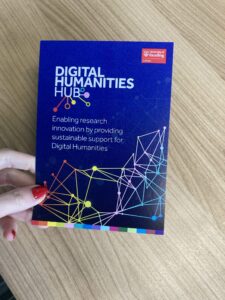
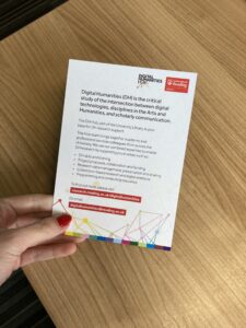
Printed and ready-to-use DH Hub postcard
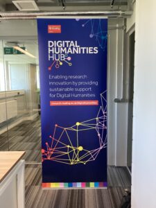
Printed and ready-to-use DH Hub banner

