Professor Rick Poynor reflects on a new exhibition of National Theatre posters and what they tell us about changing approaches to graphic design from mid-century to the modern day.
The exhibition of National Theatre posters I have curated for the theatre’s Wolfson Gallery spans more than five decades. Since the theatre’s founding in 1963, the posters’ design has been the responsibility of just five people, allowing for an exceptional degree of continuity. This makes the theatre’s output a particularly revealing case study. The posters are not only a record of how an institution central to British cultural life visualised the role of design, but they also provide an insight into changing approaches to graphic design over the decades.
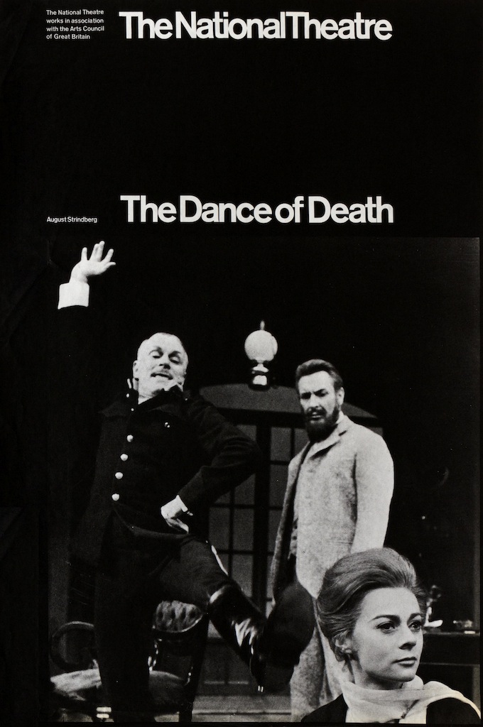
The theatre’s first graphic designer was Ken Briggs. He was influenced, like many progressive designers of that era, by the rigorous modernist Swiss typography of the post-war period. His early black and white posters for the Old Vic, the theatre’s home until 1976 when it moved to the South Bank, have a standardised structure. This can be seen in The Dance of Death (1967) – with the theatre’s name at the top and the play’s title aligned below it. The image, usually a photograph of the performers taken in rehearsal, occupies a consistent position underneath. The structure is similar to a Penguin book cover of the period.
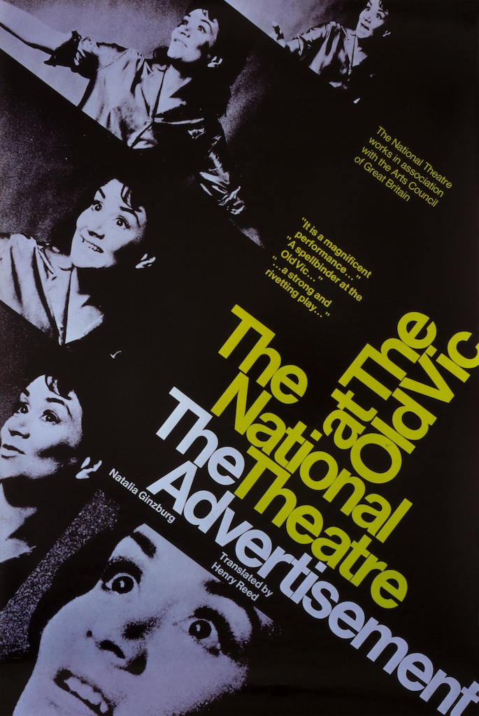
Posters shown on the London Underground needed more visual impact and Briggs designed an alternative format based on a diagonal structure. His poster for The Advertisement (1968) by Natalia Ginzburg, uses an animated montage of images of the play’s star, Joan Plowright, to cinematic effect. The type locks together in a dynamic angular cluster that again owes much to Swiss design influences.

Briggs’ successor, Richard Bird, in-house graphic designer from 1975 to 1986, was an accomplished image-maker. He took a more illustrative and expressive approach to the NT’s posters, often adapting images from art history to fit the play’s period and mood. For his poster design for a 1981 production of Thomas Dekker’s Elizabethan comedy The Shoemakers’ Holiday, Bird cut up and rearranged a woodcut by Jost Amman from The Book of Trades (1568), showing shoemakers at work, and fashioned an informal coat of arms with decorative splashes of red and gold. The battered outlines of the letters used in the title evoke the early days of printing.
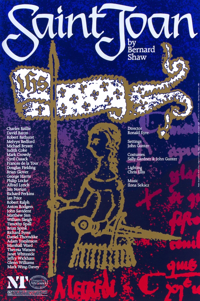
In a 1984 poster for Bernard Shaw’s Saint Joan, Bird adapted a doodle of the martyr from 1429 – the first known ‘portrait’ – for the main picture. As with all of his screen-printed posters, the image has great vibrancy of colour and texture.
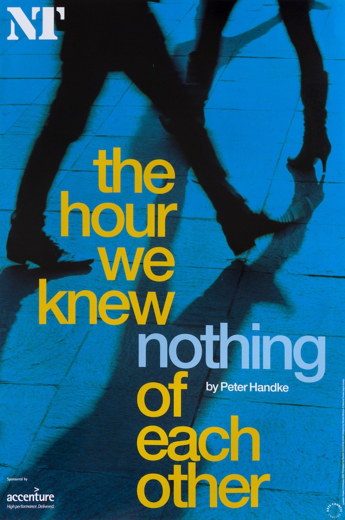
Bird’s assistant, Michael Mayhew, took over as head of graphics in 1986 and held the in-house position for the next 23 years. In 2003, he resumed using the Helvetica typeface, first introduced by Briggs, and interpreted the plays’ styles and themes with oblique photographic imagery. In The Hour We Knew Nothing of Each Other (2008), Peter Handke’s wordless drama, 27 actors play 450 characters criss-crossing a town square. Mayhew boils this chaotic tapestry of everyday life down to a pair of legs casting mysterious shadows, underscoring it with the pointed articulation of the word “nothing” in the towering edifice formed by the title.
Rick Poynor, Professor of Design and Visual Culture, University of Reading
National Theatre Posters: A Graphic Design History from 1963 to 2017 runs at the Wolfson Gallery, National Theatre, London until 31 March 2018
National Theatre Posters: A Design History by Rick Poynor is published by Unit Editions.