Professor Paul Lickiss talks us through some striking cover designs from a new exhibition of Pelican books – the non-fiction imprint of Penguin from 1937 to 1989.
Pelican books, the non-fiction equivalents of Penguin books, are the subject of an exhibition until 13 December that I have curated for the Department of Typography and Graphic Communication, to coincide with the opening of the Centre for Book Cultures and Publishing.
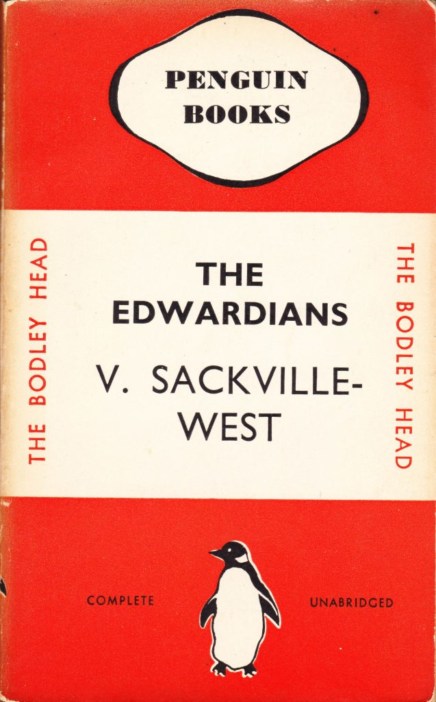
Penguin Books was founded by Allen Lane and his brothers in 1935 to publish “good books, cheap”. They were paperback reprints of hardbacks from other publishers and were priced at 6d (2 1/2 p) – about the price of a packet of cigarettes at the time, and a fraction the cost of the equivalent hardback.
Penguins became a great success with their well-known cover design of three horizontal bands. Colour coding was used to indicate the type of book, for example orange for fiction, dark blue for biographies and yellow for miscellaneous. The Pelican series of non-fiction books were given pale blue covers.
![]()

The first Pelicans were reprints of George Bernard Shaw’s Intelligent Woman’s Guide to Socialism, Capitalism, Sovietism and Fascism. These two books were not simple reprints of the original hardback, as Shaw added the new chapters on Sovietism and Fascism.
Today, the title of the books is seen as condescending. Even in the late 1920s at least some women were also unhappy with Shaw’s approach, prompting a riposte by one such ‘intelligent woman’, Lilian Le Mesurier, who wrote The Socialist Woman’s Guide to Intelligence: A Reply to Mr Shaw.

Pelicans were published throughout the war in huge numbers and were sent to personnel in the armed forces and used for educational purposes after the war.
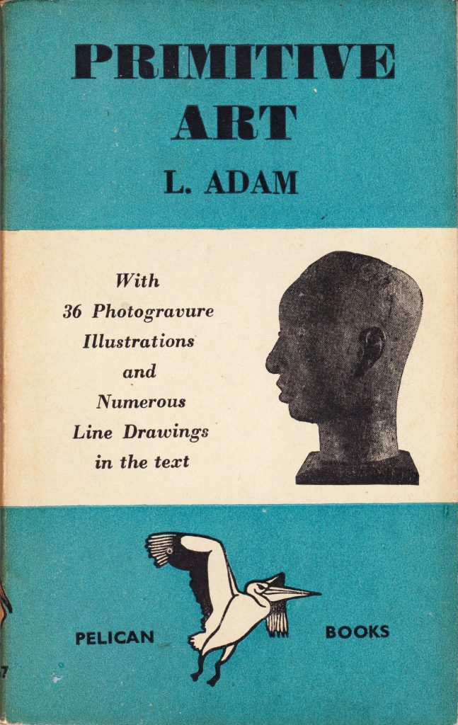
Some of the 150 or so wartime Pelican titles include: Primitive Art, Town Planning, The Childhood of Animals, The Physiology of Sex and its Social Implications, Plastics, English Justice, An Anthology of Canadian Poetry, The Biological Control of Insects, The Physical Basis of Personality, Why Smash Atoms? and Reading for Profit. The latter was written in a prisoner of war camp and was then allowed to be sent to England for publication!
![]()
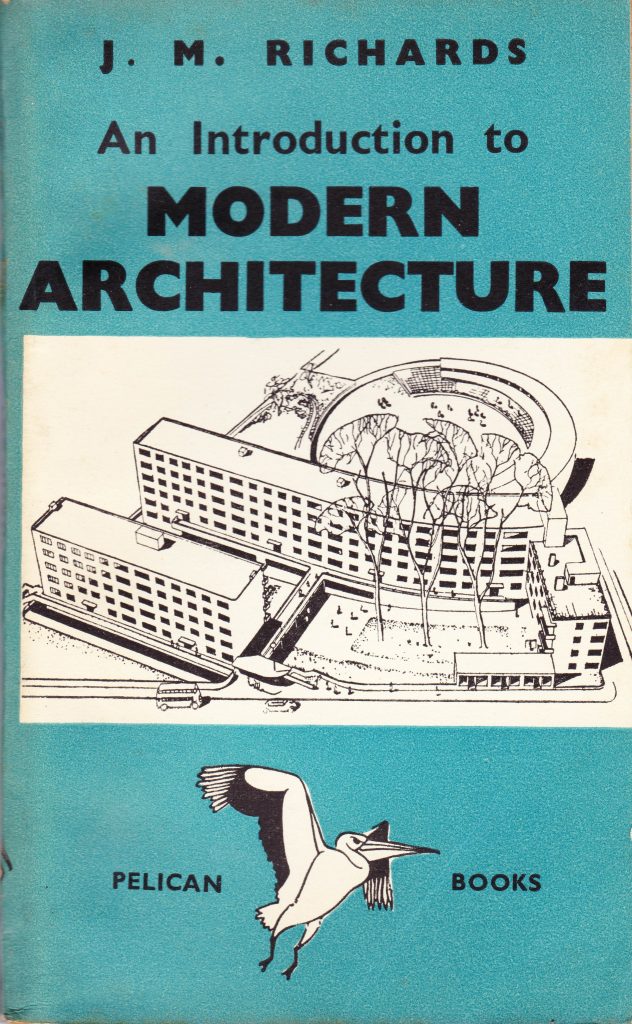
Initially all Pelicans had the familiar tri-band cover, but from the start of the war, some books started to have pictures inserted into the white central band. Thus started a long discussion within Penguin about whether their books should have pictorial covers or should remain true to their origins and be a distinctive brand without any need for pictorial adornment.
In 1947, the German typographer Jan Tschichold was brought in by Penguin to give some order to the increasing varied publications. Tschichold drew up a set of Penguin Composition Rules and applied them rigorously. He introduced a new ‘vertical grid’ cover design as we see here in The Symphony and The Life of the Robin.
![]()
![]()
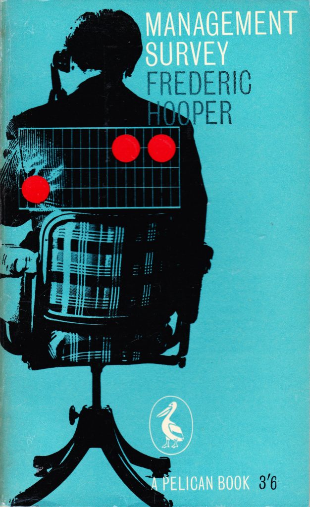
Hans Schmoller succeeded Tschichold, built on Tschichold’s clear design foundations and helped establish Penguin Books as a design icon. Under Schmoller’s leadership a wider variety of cover designs were trialled, including designs in which the main part of the cover was a picture, and the introduction of colour as we see here in Memory Facts and Fallacies and Management Survey.

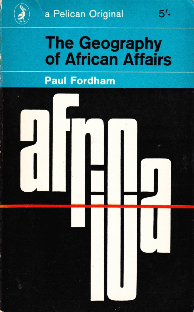
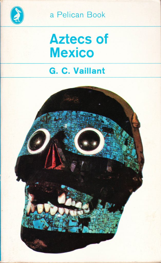
Germano Facetti joined Penguin in 1961 and took the book covers from being largely typographic to being visual. He appointed designer Romek Marber, who came up with a new grid design that split the cover into the upper text area and a lower panel for a picture. Hundreds of Pelican and Penguins were produced with this cover format and it became almost as recognisable as the earlier blue and white covers. Aztecs of Mexico and The Geography of African Affairs are two examples.
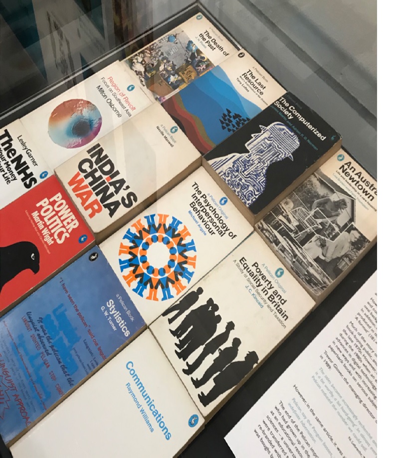
By the mid 1970s, the heyday of Pelicans had passed as new publishing media increased competition to traditional paperbacks. The only remaining vestiges of the Pelican brand were the Pelican device on the cover and ‘Pelican blue’ being used for many book spines.
Decreasing sales ceased publication of Pelicans in 1989 and they were dormant until 2012, when a handful of new Pelicans appeared on scientific topics. In 2014 Penguin announced that the Pelican series would be re-established. The new series appeared in a pale blue livery, similar to, but distinct from the original Pelican blue.
The Pelican device was re-drawn and the first fourteen books are plain covered paperbacks, while the next ten have a cover illustration. The most recent books, published in 2019, have appeared first in hardback: the future looks bright for the series.
![]()


The ‘Pelican books by design’ exhibition runs until 13 December at the Department of Typography & Graphic Communication, TOB 2, Earley Gate, Whiteknights Campus, University of Reading, Reading RG6 7BE. The exhibition marks the launch of the new University of Reading Centre for Book Cultures and Publishing, which aims to foster cross-disciplinary research relating to publishing, printing and books. Follow the centre on twitter at @cbcp_UniRdg
Paul Lickiss is a chemistry professor at Imperial College who not only has a lot of chemistry books in his office but has what is probably the most complete collection of Pelican books anywhere in the UK. He has compiled a database of all known Pelicans and writes extensively about them including a recent book to celebrate the 80th anniversary of their first publication.