Introduction
This is the first of a series of posts on Arabic justification. It begins by setting out some basic – but rarely expressed – observations about the subject which underpin the following discussion. It will then consider the typographic legacy of justification in a very short history. To understand the current situation, and to consider an informed way ahead, we have to know how we came here.
A second post will review current software implementations, the available options, and discuss their approaches, qualities, and shortcomings. Having established current typographic justification of Arabic, a further post will examine exemplary historical practice from the Middle East with the aim of identifying clues that may contribute towards the advancement of current practice.
The basics of Arabic justification
Arabic justification, i.e. the filling of a line of text to achieve uniform lengths for all lines of a column, uses different concepts to those that are widely known from the Latin script. Because most Arabic letters connect, hyphenation, i.e. the breaking of words at the end of a line, is generally not practised (there are some exceptions, notably the modern Uyghur orthography which adopted word-breaks across lines in typography).1
In Arabic texts, handwritten and typographic alike, the remaining space of a line is principally filled using a combination of three techniques: (1) the variation of letterforms (principally elongation and alternative letterforms), (2) changes in the density of black and white, and (3) the configuration of words, including the vertical stacking of letters, reduction of size, and extension of the line into the margins. In the context of typography, the latter is of marginal relevance, and this post will only consider the first two techniques.
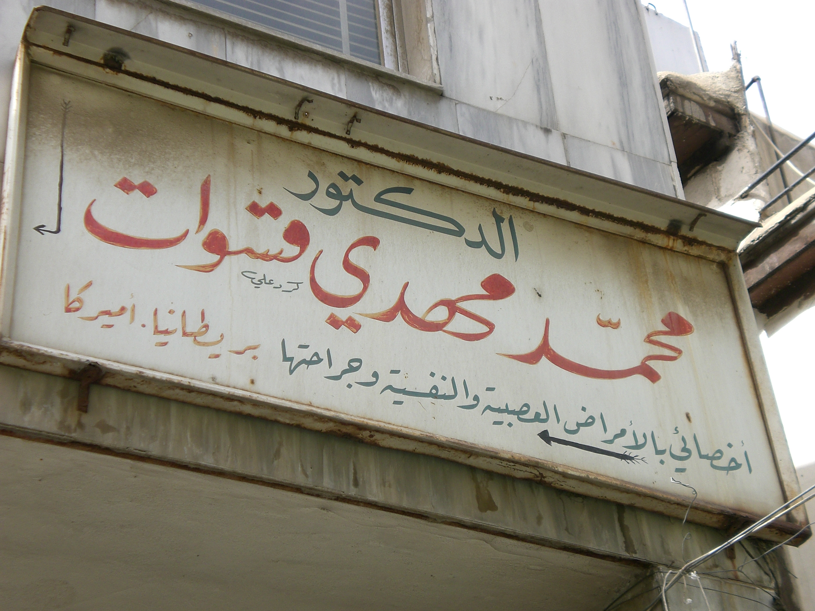
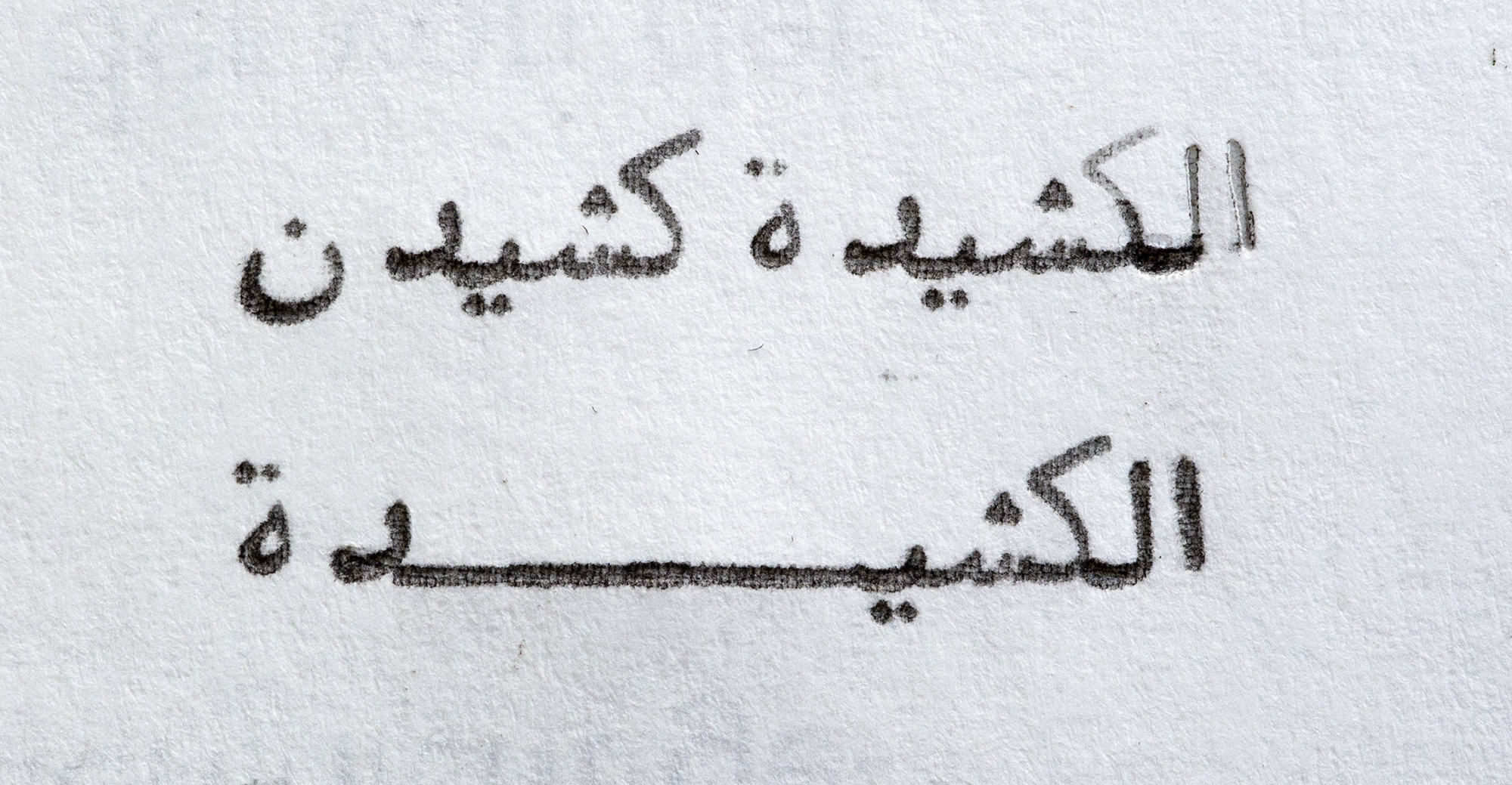
The most prominent technique for Arabic justification is elongation, and it is known by various terms with ambiguous usage, including notably kashīda, madd, and taṭwīl.2 Whilst kashida (in the simplified English spelling) is most frequently used, it often lacks precision of meaning. However, amongst authors engaging the subject of justification there appears to be growing consensus that kashīda is the preferred term for the elongation of letter parts, agnostic of technological implementation.3 This post employs the more elaborate distinction that Thomas Milo established in the context of DecoType’s technology,4 in which kashīda relates to the elongation of letterforms by means of curvilinear strokes following conventions observed in manuscript practice, and taṭwīl refers to the Unicode character U+0640 Tatweel.5 A further, specialised case of elongation are swash variants of letterforms. Although also used for justification (amongst other uses), they are governed by different rules to kashīda elongation, and will be referred to here as swash variants.
By contrast, the Tatweel extension stroke, although widely seen as the standard means of justification in Arabic, is an artefact of typographic technology and should be considered separately. The Tatweel is discussed more below, but suffice it to say at this stage that it should not be regarded as a feature inherent to the script. It is important to note that the elongation of letterforms does not mean stretching (which implies a simple distortion), but a reconfiguration of the whole letterform, and that only some letters, and only certain parts of them may be elongated – and that much only in specific, style-dependent contexts.
From Arabic manuscript to letterpress justification
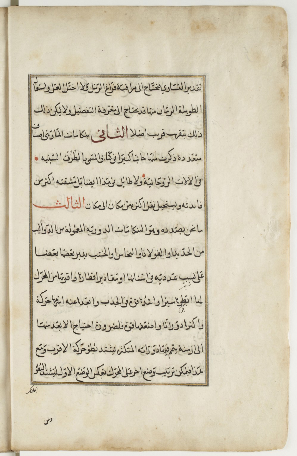
When printers adopted typography to compose Arabic texts, justification principles had to be translated into the new medium. In manuscript production a scribe could use his experience to approximate the number of words he could fit in a given line. Whether he needed more or less space he could tweak the proportions of letter shapes, the width of white spaces, the vertical arrangement of letters and words etc., all before resorting to the more visible justification means: swash letterforms and elongations. Scribes thus had a range of tools to make a written line fit the column.
In letterpress printing not much of this malleability remained. Although white space could be modified too, it was not as flexible. Adding quads to fill a line was easy enough, but reducing the space between sorts required a disproportionately bigger effort by the compositor than by the scribe. Letterforms, on the other hand, could not be modified at all, considerably reducing the margin of manoeuvre. Metal type thus left the compositor with three means to quickly justify a line and lock the forme:6 (1) increase the width of word spaces, (2) use swash sorts if contained in the font and applicable in the given line, or (3) insert specialised sorts between letters to mimic the elongation of letter parts – enter the Tatweel.
Although technically possible, it was economically inconceivable for compositors to create elongated letters as they were needed. In principle typesetters had to work with the font at hand, employing its sorts to the best effect, and as quickly as possible. Rather than making custom sorts for every justified line, typography’s modularity was therefore used to imitate Arabic elongation by means of a dedicated typeform: the Tatweel.7 It was first used by European type-makers and printers when they began composing Arabic in the sixteenth century. Straight extension strokes can be found at least as early as 1516 in a multilingual volume of the gospels published in Genoa, and henceforth it remained a feature of European Arabic typography.8 The utility of the Tatweel is obvious, and would have been appreciated by the compositors of Arabic type. A uniform, straight line that could be repeated as desired and inserted between any connecting letterform greatly facilitated their work. If setting Arabic was laborious, at least its justification was easy.
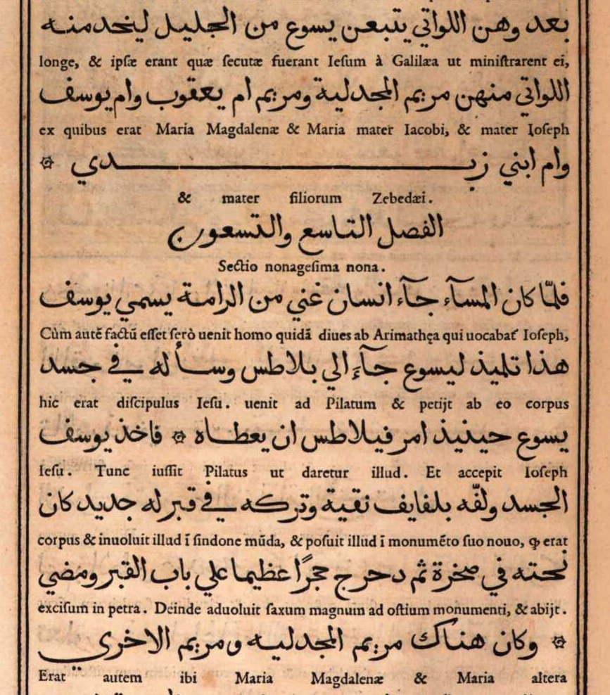
Yet, the compromises of Arabic typography justified with what amounts to a horizontal rule may not have been appreciated by sixteenth century compositors.9 Although the basic principle of elongation could be readily observed and explained by Oriental scholars, typically involved in the context of European typography, the more elaborate rules underpinning it remained opaque to the first printers of Arabic texts. This discrepancy is well illustrated in books produced at the Medici Oriental Press in Rome. Backed by considerable political and economic clout, its Arabic volumes were widely regarded as hallmarks of scholarly and artistic achievement.
The renowned French punch cutter Robert Granjon, then at the height of his career, was commissioned to cut new Arabic types specifically for the task, and produced five fonts in various sizes.10 Their influence was considerable as they were widely copied and until recently held up as role models of Arabic type-making.11 The fonts achieved somewhat greater fidelity with the Arabic script than their precursors, and included swash variants and some elongated letterforms that Granjon may have intended for justification. Yet the publications of the Medici Oriental Press are dotted with instances in which the compositors still resorted to inserting straight Tatweel sorts, with predictably alien results. Whereas Granjon’s fonts had a lively appearance, with a multitude of curves and rounded strokes, justification by means of the Tatweel introduced a geometric linearity nowhere else to be found – excepting the margins surrounding the column. The unrestrained use of this sort stretched words beyond recognition, and created blank spaces without apparent function, undermining a central tenet of typography for reading: lending shape to meaning.
Mechanical justification and the Tatweel: made for each other
Notwithstanding these shortcomings, the Tatweel remained in use. Indeed, rather than disappearing with advances in technology, it appears as if increasing mechanisation contributed to its proliferation. Machinery and industrial manufacturing processes favoured modular concepts, and systematic organisation. Point sizes and the organisation of type widths into repeatable units are but two elements of type-making that had resisted uniformity and consistency for hundreds of years, but were standardised soon after mechanical processes supplanted manual techniques. The Tatweel fitted very well into the systematisation of type-making and typesetting, whereas the formal variety expressed through swash characters, for example, did not.
With the emergence of the typewriter in the nineteenth century, the segmentation of the Arabic script into recurring elements reached a new low. Although the repertoire of forms that could be represented with 90 keys required a drastic cull of letterforms, the Tatweel kept its place in the characterset. Thus it attained unprecedented prominence, and today justification using the Tatweel, although historically inaccurate, is often associated with the typewriter and its drastic simplification of the Arabic script.
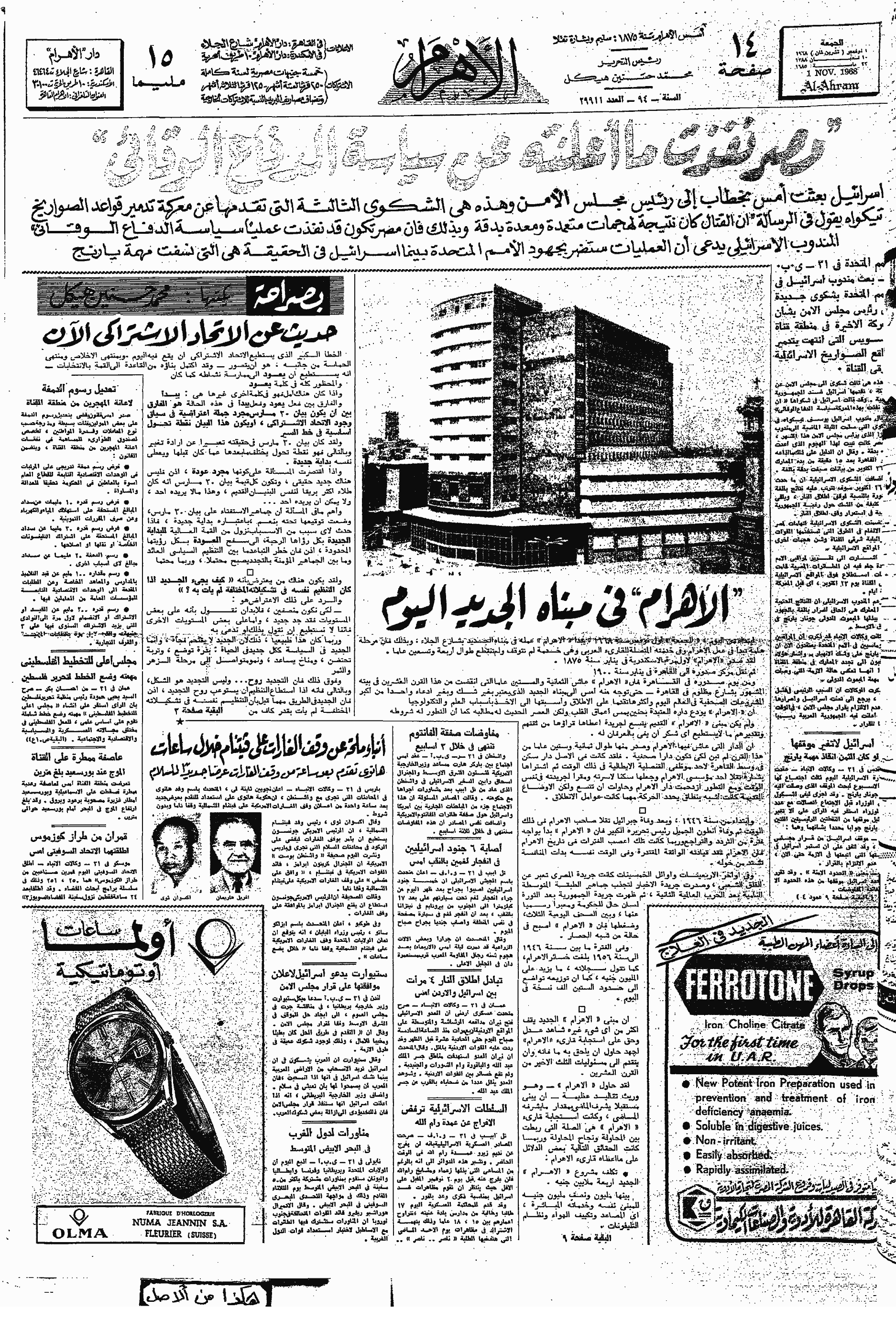
Throughout the twentieth century, and across the numerous technological changes that it saw, the Tatweel retained its place. From the first Arabic Linotype (1911), to the first Monotype system for Arabic composition (1939), photocomposition devices, and computer-assisted typesetting, the Tatweel was included in fonts, and used in typography. When Linotype & Machinery and Compugraphic co-developed the first automated Arabic justification computer in the second half of the 1960s, the role of the Tatweel was firmly established.12 Hrant Gabeyan, at the time L&M’s representative to Egypt and Sudan, became responsible for the design of the substitution tables that governed the justification ‘choices’ of the computer. We know that Gabeyan consulted a range of professionals in the field, including calligraphers, teachers and Linotype operators, to inform his task, yet the exact process and the rationale that guided the resulting specifications are difficult to reconstruct today. Probably the prospective customer of the system, the Al-Ahram newspaper, had considerable influence on its design, tailoring it to the needs of newsprint composition. The Arabic JusTape justification computer was built around the Tatweel as the principal means for justification, and modification of white space and elongation of letter shapes were disregarded. Indeed, the patent that L&M filed to protect its invention lists the term ‘kashida’ 64 times across its 12 pages.13 Although the JusTape primarily automated what newspaper compositors in the 1960s already did, it also codified practice, and thereby established a precedent for subsequent automated justification systems.14
Tatweel today
Over time, and through continuous, uncritical repetition of previous practice the Tatweel secured its place in contemporary typography. A place that was cemented, for the time being, through the inclusion of a discrete Unicode codepoint in version 1.1 of the Standard in 1993. ‘U+0640 Arabic Tatweel’ is defined as a modifier letter with the ‘join causing’ property. The Standard notes that this differs from the ‘dual joining’ property in that characters of this class ‘do not change shape themselves’. Thus, according to the standard that encodes nearly all contemporary text, the Tatweel is a solid rule, in shape and behaviour identical to the sorts that European type-founders used in the sixteenth century. Unicode therefore assigns semantic meaning – a codepoint – to what should be a purely graphical device, demonstrating one of the many inconsistencies of the Standard. After all, a central tenet of Unicode is the distinction between semantics and form, between characters and glyphs. Yet because many of its principles derive from typographic legacy, technological artefacts such as the Tatweel entered its conceptual framework.
The pronounced technological bias is also manifest in the inclusion of the Tatweel on most contemporary Arabic keyboards.15 One of the unintended consequences of the hard-coding of a graphical elongation device is that users employ it for purposes that it was not meant to be used for. For example it is common that users key Tatweel characters in order to trigger joining behaviour. Because some fonts fail to make the expected isolated form of Heh accessible, users frequently key Heh followed by Tatweel to give them the initial form of Heh, visually more similar to the required isolated shape, but then followed by the straight Tatweel bar.
Another problem of hard-coded elongation is searchability. Because a Tatweel inserts a character into a string of characters, albeit only for graphical purposes, in some environments searching a particular word won’t yield results. Although present in the text, a word that contains Tatweel characters will not be found by the search again if the user keys the word in non-elongated form. Thus a search for طويلة cannot be found if the text contains an elongation using Tatweels such as here طويــلة. Examples of this problem can be found in Mozilla’s Firefox browser, or Apple’s default text editor TextEdit.
Today, we are thus left with an ambiguous situation. Although we have at our disposal sufficient computing power that could easily reproduce the Arabic script without recourse to inadequate simplifications, advance is hindered by the continuation of legacy practices, and concerns for backwards compatibility. The Tatweel is a particularly clear example of the influence that legacy practice, rooted in obsolete technology, remains in use today. It only provides a coarse approximation of a central requirement of basic shaping in Arabic. Whereas limitations of technology may historically have provided the explanation or rationale for such a compromise, today there is no reason to accept inadequate representations of any script in type. If we imagine for a moment that an equivalent shortcoming in the typography of the Latin script – say the distinction between capitals and minuscule letters – could not be handled by layout engines, we can be sure that the industry would rush to address this shortcoming.
In the following post I will review the state of Arabic justification in various software environments. I will discuss the options of the most wide-spread professional design applications, word processors, and browsers, and consider their strengths and weaknesses.
Corrections
An earlier version of this post published on 15 Nov 2019 at 09:31 incorrectly stated that any browser-search would be handicapped by the use of Tatweel, when in fact this problem pertains only to software that is based on the Gecko engine that is used notably for Mozilla’s Firefox browser.
Notes
1 In early manuscripts word-division at the end of lines was common, but this practice fell into disuse. Gacek, Adam, Arabic Manuscripts: A Vademecum for Readers, Leiden ⸱ Boston: Brill, 2009, 146.
2 Kashīda derives from the Persian کشیدن, to draw, pull; to extend, protract.
3 See e.g. Elyaakoubi, Mohamed & Azzeddine Lazrek, ‘Justify Just or Just Justify’, The Journal of Electronic Publishing, Volume 13, Issue 1, Winter 2010, http://dx.doi.org/10.3998/3336451.0013.105; Benatia, Mohamed Jamal Eddine & Mohamed Elyaakoubi & Azzeddine Lazrek, ‘Arabic text justification’, TUGboat, Volume 27, No. 2, Proceedings of the 2006 Annual Meeting, pp. 137–146.
4 Milo, Thomas, Tasmeem: The Spirit of Arabic Writing, Grenoble: WinSoft, 2006, 23.
5 The Unicode Standard considers the two terms as synonymous. The Unicode Consortium, The Unicode Standard, Version 12.1.0, (Mountain View, CA: The Unicode Consortium, 2019. ISBN 978-1-936213-25-2), http://www.unicode.org/versions/Unicode12.1.0/
6 Locking the forme, ensuring that all sorts and furniture stayed in place during printing, was significantly easier if text was justified, rather than ragged. Similarly it was much faster to cut a paper frisket for a justified block, and re-use it on every page, than it was for a block with different line lengths which could only be used once. Both aspects contributed to the prevalence of justified setting in letterpress printing.
7 I am not aware what term was used for this sort in the first Arabic letterpress fonts. In this post Tatweel is used for consistency.
8 The polyglot Psalterium, Hebræicum, Græcum, Arabicum, & Chaldæum emerged from a collaboration between the orientalist and Bishop of Nebbio in Corsica, Agostino Giustiniani (1470–1536), and the printer Pietro Paolo Porro.
9 As any cursory review shows, neither do many contemporary practitioners.
10 For a thorough analysis of Granjon’s Arabic types see Conidi, Emanuela, ‘Arabic Types in Europe and the Middle East, 1514–1924: Challenges in the Adaptation of the Arabic Script from Written to Printed Form’, PhD thesis, University of Reading, UK, 2018.
11 See for example Yasin H. Safadi, “Printing in Arabic,” Monotype Recorder no. 2, New Series (October 1981): 4.
12 Note that L&M’s system used the term ‘Kashida’. See also Titus Nemeth, Arabic Type-Making in the Machine Age: The Influence of Technology on the Form of Arabic Type, Boston ⸱ Leiden: Brill, 2017, 183–204. https://doi.org/10.1163/9789004349308
13 Lamberti, Sergio. Means For Controlling Typographic Composing Machines. UK Patent GB1162180, filed 24 December 1966, and issued 20 August 1969. This patent may have contributed to establishing the term ‘kashida’ in the trade: In Gabeyan’s documents the term ‘kashida’ was always set in quotation marks, whereas the author of the patent removed them, using kashida without explanation or qualification.
14 Gabeyan developed another justification system for Compugraphic’s own Arabic typesetting system in the late 1970s when the company tried to enter the Middle Eastern market. At that time it also developed Arabic fonts which, in line with its catalogue of Latin typefaces, were clones of the commercially most successful designs by the competition. In 1988 the Compugraphic Corporation was bought by Agfa Gevaert. The new owner subsequently licensed Compugraphic’s Arabic fonts to the Microsoft Corporation, where they were used as the default Arabic script fonts of the Windows operating system for more than a decade. Although this is pure conjecture, it appears plausible that Microsoft, at that time without any experience in developing Arabic typesetting software, built on Compugraphic’s justification system. Should this be the case, a direct line can be traced from the justification system that was developed for a hot-metal line-caster to those in use in today’s digital devices.
15 By contrast, one of the letters that are required for the correct spelling of Allah, U+0670 Arabic Letter Superscript Alef, is not accessible on common Arabic keyboards.