Introduction
In the first post of this series, I summarised a brief history of typographic justification of Arabic. It provides the background for the observations that follow, discussing how text can be justified in current software environments. The observations in this discussion are always temporary, since software updates may change the situation over night. Having said that, developments in the support of Arabic typography are not as rapid as the pace of wider technological advances would suggest. Although much has changed since the introduction of computer typesetting, many aspects of Arabic typography have changed little in comparison to thirty years ago. Many of the underlying assumptions have remained in place, as demonstrated by the perseverance of the Tatweel character, or the semantic encoding of Arabic ligatures in The Unicode Standard.
How current is current practice?
The two central technologies of current mainstream typography, OpenType and Unicode, promised global typography at their inception. Both are now well into their twenties, having been published in 1996 and 1991 respectively.1 By way of a reminder, 1991 was the year of the Second Gulf War; the year when Tim Berners Lee announced the World Wide Web; the year the Soviet Union was dissolved; the year that the Yugoslavian civil war commenced; when Bill Clinton was yet to run for president; and when Michael Jordan won his first NBA championship.
Yet the fragmented support of OpenType features by text layout engines, the continuation of competing font formats, and widely divergent agendas of key stakeholders prevented the main typographic technologies from advancing substantially beyond their Western origins.2 Apple, for example, keeps maintaining and developing its in-house text layout engine Apple Advanced Typography (AAT) in parallel to providing support for OpenType, in effect dividing the resources available for typography between two formats. As a consequence, support for AAT is better than support for OT, despite the latter being much more widely used. Adobe’s record for typographic support beyond the Western hemisphere has been haphazard too. Since the making of Middle Eastern versions of Adobe’s applications was pulled from a dedicated supplier, and handed to in-house development, advances were piecemeal, poorly documented, and opaque. The gradual roll-out of the so-called ‘Adobe World-Ready Paragraph Composer’ is moderated by the continued use of the older ‘Adobe Paragraph Composer’ for backwards compatibility. Its features are not comprehensive, as will be shown below. Microsoft has been one of the more active proponents of the OpenType format, developing lighthouse projects such as the fonts ‘Arabic Typesetting’ and ‘Al-Dhabi’. Yet typographic support in its flagship application suite Office remains inconsistent, with a user interface that leaves much to be desired, and hamstrung by irreconcilable contradictions between the aspirations of the designed typefaces, and the underlying technology.
Non-Silicon Valley
Against the background of the slow-moving, Silicon-Valley juggernaut with apparent biases towards the Western hemisphere, alternative approaches have been evolving in parallel since the beginnings of personal computers. The Dutch company DecoType has been in the business of developing dedicated Arabic typographic technology since the mid-1980s, and in Iran the company Sinasoft has been making capable software since 1985. From the early 1990s Klaus Lagally of the University of Stuttgart has been developing ArabTeX, a macro package based on Donald Knuth’s TeX that provides typesetting capabilities for the Arabic script.
More recently related approaches, specifically concerned with Arabic text justification, are found in the work of Mohamed Jamal Eddine Benatia, Mohamed Elyaakoubi and Azzeddine Lazrek, as well as Aqil M. Azmi and Abeer Alsaiari.3 However, they do not seem to have evolved beyond prototypes. In the context of the TeX community, one may also mention Andreas Hallberg’s recent contribution that seeks to address the poor support of Arabic justification in typesetting software.4 Although Hallberg’s method is limited, it demonstrates that the need for solutions is such that users have to resort to building their own tools in face of inadequate available means.
The evangelical Christian organisation SIL International has a substantial record of making type and typographic technology for scripts and languages that are underserved by commercial offers.5 As a result of the slow advances of the OpenType format for complex scripts, SIL has developed its own font format, Graphite, and made it freely available.6 It provides more powerful shaping capabilities, as well as a built-in algorithm that automatically prevents collisions of glyphs, a key feature for scripts and writing styles that display a high degree of contextual variation and non-linear joining.
Recently Simon Cozens also developed a new typesetting system called SILE, borrowing concepts of TeX and improving upon them. Cozens’ initial work focused on the development of features that are not found in mainstream software, providing, for example, Uighur hyphenation capability.7
The state of Arabic justification support
Having sketched out the current landscape of Arabic typography software, the following discussion attempts to provide an overview over some of the most widely used applications and their justification capabilities.
Adobe Creative Cloud applications
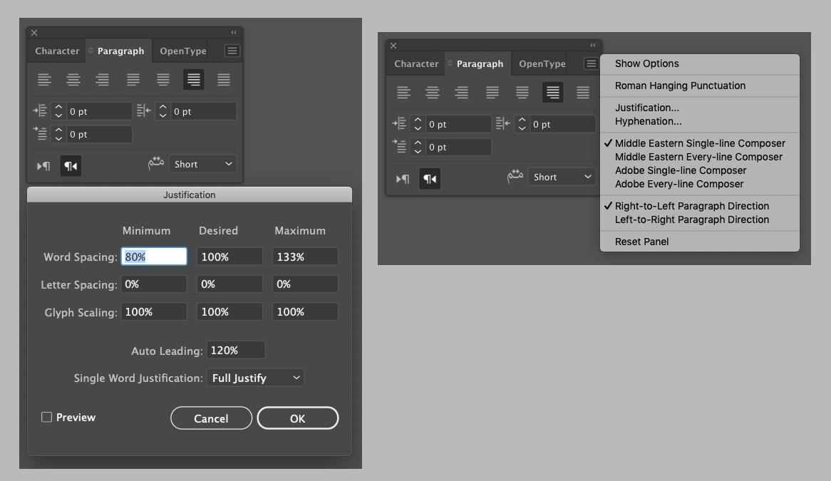
Adobe is the undisputed market leader for professional design software. Its applications are widely used, and highly regarded. Adobe’s type library was among the first to be converted to the OpenType format, and applications such as InDesign pioneered support for the added functionality when competitors lagged behind. However, since the early 2000s this dynamic has changed, and advances slowed down. When Adobe began to develop Arabic script functionality in-house, documentation of the features emerged in Adobe’s official publications.8 Unfortunately some of the options are not explained, and aspects of the text betray a superficial grasp of the subject, as well as sloppy editing. On the subject of justification, the official help document states:
In Arabic, text is justified by adding Kashidas. Kashidas are added to arabic [sic] characters to lengthen them. Whitespace is not modified. Use automatic Kashida insertion to justify paragraphs of arabic [sic] text.
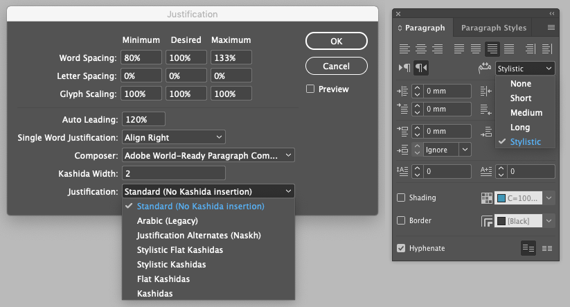
Select the paragraph and from the Paragraph panel (Window > Type & Tables > Paragraph), choose a setting from the Insert Kashida drop-down list. The options available are: None, Short, Medium, Long, or Stylistic. Kashidas are only inserted if the paragraph is justified. This setting is not applicable for paragraphs that have alignment settings.
To apply Kashidas to a group of characters, select the characters and choose Kashidas from the Character panel menu.
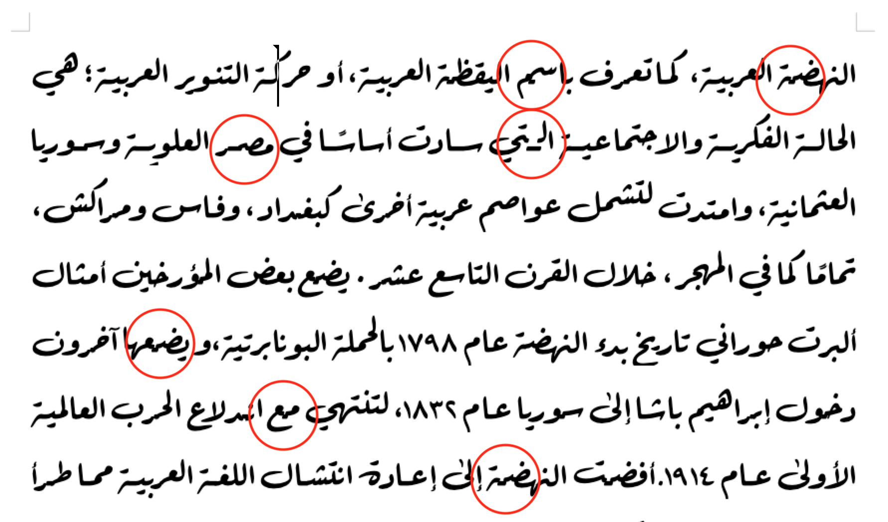
Whilst the description of kashīda elongation appears to describe Tatweel insertion instead, and the categorical rejection of any other justification technique in Arabic is debatable, the key issue is that the listed options are neither complete, nor are their effects explained.9 A review of the menu reveals that further to the five options mentioned above, users can also select a numerical value for ‘Kashida width’, as well as an additional four (!) options: (1) ‘Arabic (Legacy)’, (2) ‘Justification Alternates (Naskh)’, (3) ‘Stylistic Flat Kashidas’, and (4) ‘Flat Kashidas’. This assumes that the options provided in the other menu map to ’Stylistic Kashidas’ and ‘Kashidas’. What is most astonishing, however, is that not one of these options is explained, nor its effects documented, nor the rationale for this plethora of options provided.
Putting these options to the test unfortunately is not any more satisfactory. Whereas the various length settings do indeed change the lengths of the automatically inserted Tatweel strokes, the meaning of the other options remains incomprehensible to the author. Indeed, no change is observable upon selection of the respective ‘Flat’ option. Besides the pointless range of selections, and lack of documentation of their effects, not to speak of rationale, the most troubling aspect that can be observed is that the justification algorithm breaks the text when glyphs join anywhere else but along the flat baseline. Thus, so-called ligatures that are formed with two distinct, dedicated type forms that are substituted in a given context (contextual alternates), are broken up by straight bars along the notional baseline.
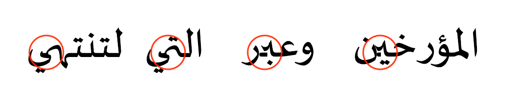
‘Justification Alternates (Naskh)’ is the one redeeming aspect of InDesign’s Arabic justification system. If a font provides this feature (jalt) with corresponding alternate glyphs, InDesign will use them to attempt to fill the line. Rather than activating all available glyphs, the algorithm appears to calculate the available space in a line and only selects such variants where applicable. Furthermore it combines the use of these alternates with the variation of white space and Tatweel extension strokes, making it an appropriate justification algorithm for Arabic.
Unfortunately also this option is unaware of joins that are not along the baseline. As a consequence, Arabic fonts that make use of any non-linear substitution or positioning as provided in the OT specification through features like ‘Cursive Positioning‘ (curs) or ‘Contextual Alternates‘ (calt) – incidentally the latter registered by Adobe and theoretically widely supported – cannot be set justified in the leading professional page layout application.10
Adobe Illustrator provides only the five options that are present in InDesign’s Paragraph palette, relieving the user of some of the redundant choices.11 Unfortunately, it does not include InDesign’s best method, ‘Justification Alternates (Naskh)’, and it also suffers from the erroneous insertion of extension strokes between contextual alternates.
Adobe Photoshop, meanwhile, although providing the same interface for Kashida insertion as seen in InDesign and Illustrator, makes life even more confusing for the user. Here no change at all can be observed when either of the five options is selected. Justification is achieved only through adjustments of word spaces, and as no elongation strokes are inserted, contextual alternates are not broken either. Photoshop does, however, provide a tick-box option for ‘Justification Alternates’. Yet, unlike in InDesign’s algorithm, here all alternates provided in a font get activated irrespective of line-length, making it yet another useless option.
In conclusion we can observe that despite the plethora of options, in current Adobe CC applications Arabic fonts that make use features defined in the OT specification since 1996, some of which are nominally supported, can only be used with the default justification method that modifies word spaces. More simplisitic fonts that forego the theoretical possibilities for better Arabic typography may be justified using the other options built into the applications. Whether the Tatweel strokes are inserted in suitable positions is not documented, and I did not verify it given the glaring shortcomings already observed.
Word processors, aka office applications
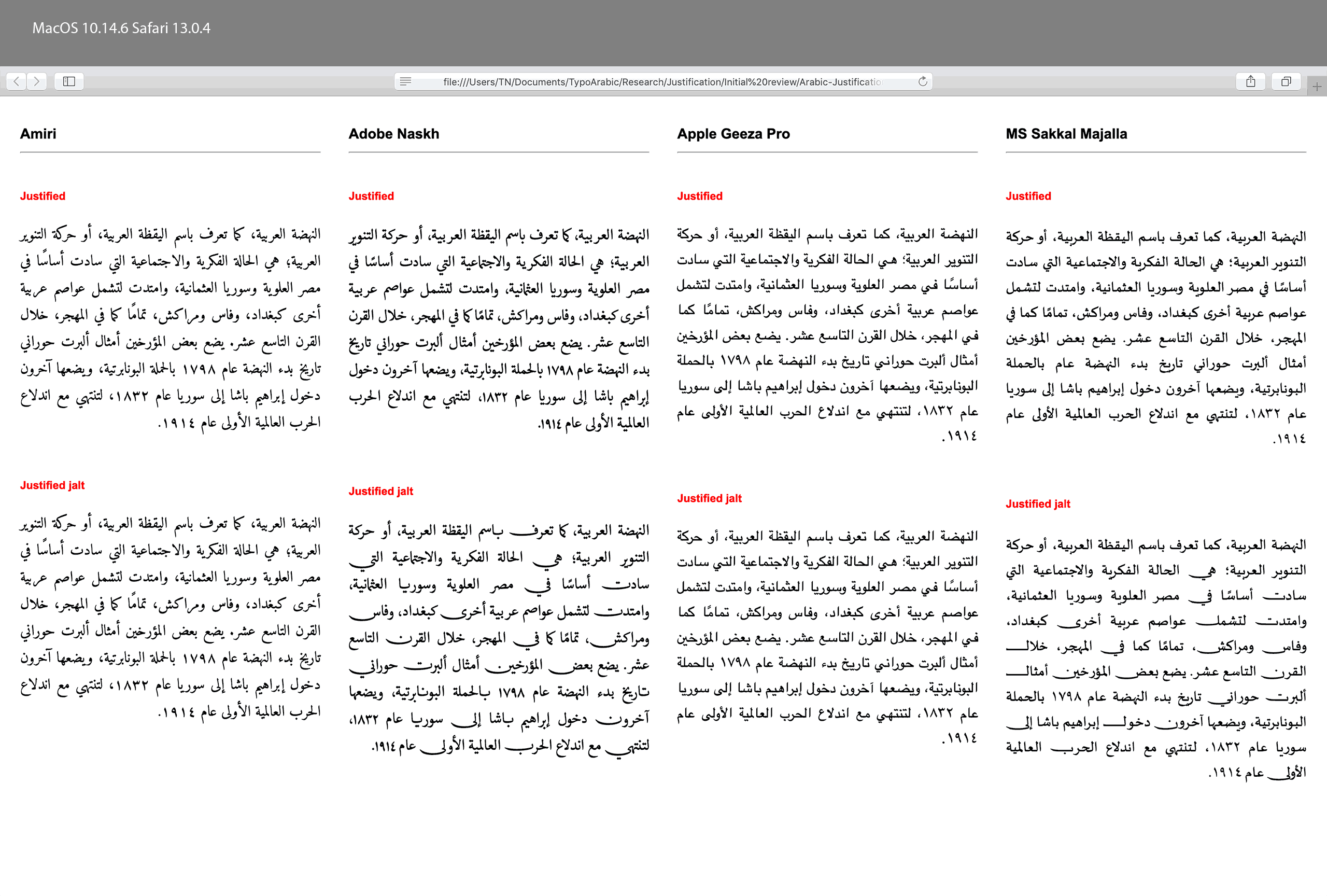
Whereas Adobe’s professional design applications promise many options without delivering on them, office software has a much broader user base, and therefore provides less choices. Typographic design decisions are instead made on behalf of the user, either by default settings, design templates, or simply by the absence of controls. For the purpose of this post, I have reviewed the capabilities of three leading word processors, Microsoft Word for Mac, Apple’s Pages, and LibreOffice. All three offer a similar set of typographic options, but whereas Pages and LibreOffice provide only ‘Justified’ as an option, Word offers justification by space or by Tatweel insertion.
Whereas Adobe’s software is only able to make use of the Arabic layout features in OpenType fonts, the three word processors support different font formats.12 Here the platform bias mentioned above comes into play. Whereas Microsoft’s applications only understand OT layout, Apple’s system apps provide support for OT and AAT, whilst LibreOffice can handle Graphite, in addition to OT and AAT thanks to its use of the Harfbuzz shaping engine. As a consequence, the typographic capabilities of each word processor change significantly depending on the font format in use. Unfortunately this remains entirely opaque to the user. None of the applications provide any meaningful indication about the format of the various fonts listed in the font menu. A user may thus select a font whose layout technology is not supported by the application, with the result that the text shaping breaks. Apart from the visual result, this is not fed back to the user either.
Microsoft Office Word on Mac handles Arabic OT fonts in the expected, minimal way. By default justification is achieved by variation of white space, and the rather unintuitive options ‘Justify Low’, ‘Justify Medium’, and ‘Justify High’ enable Tatweel insertion similar to Adobe’s ‘Short’, ‘Medium’, and ‘Long’ selections. There is no option to select justification alternates. Whereas the default strategy produces acceptable results for full width columns, decreasing the measure quickly reaches the limits of this approach.
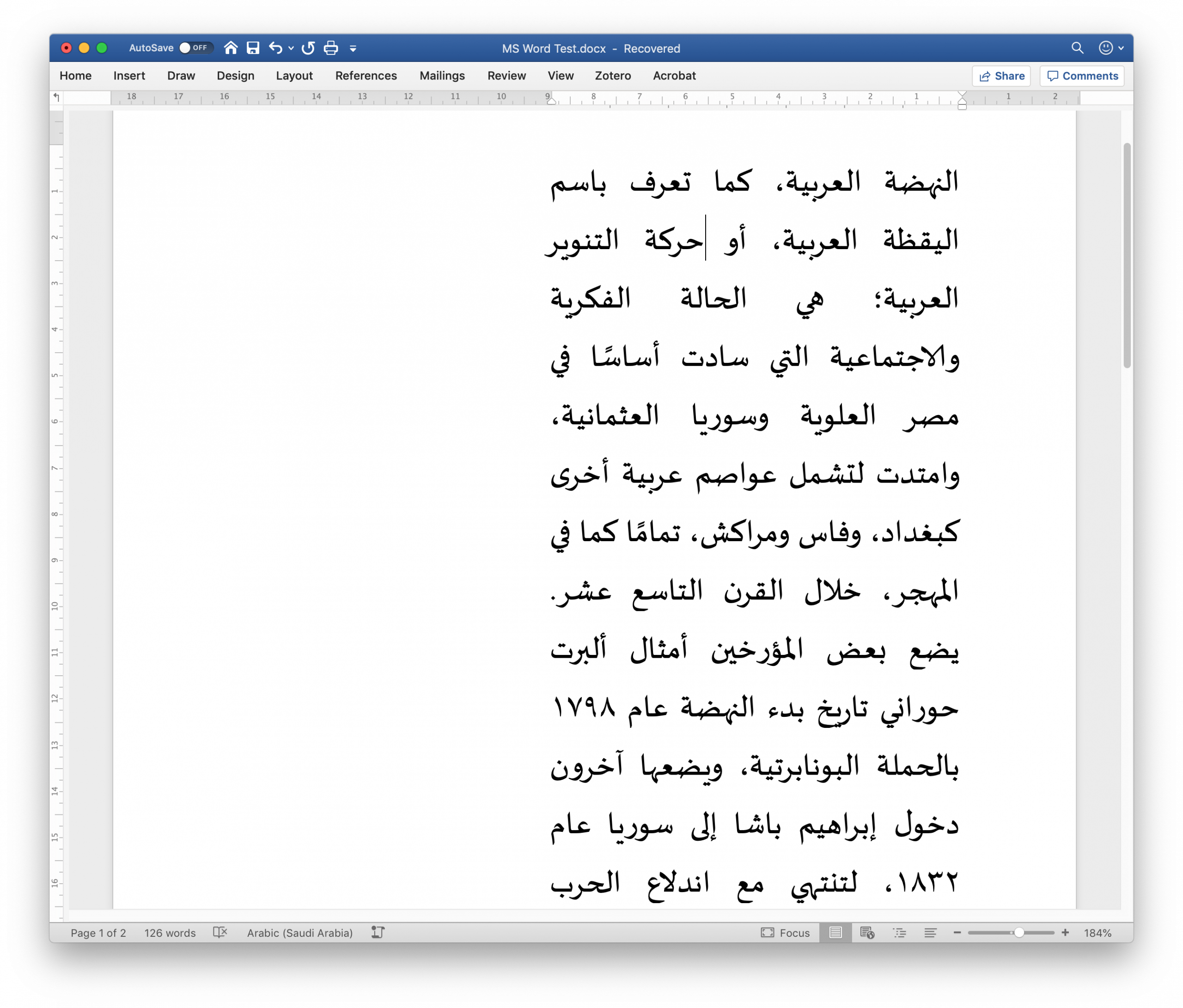
For this context one of the three options that employ Tatweel-like kashida insertion may be used, resulting in more evenly distributed white spaces. However, and although the font and the application are both distributed by Microsoft, also here straight Tatweels are inserted between contextual alternates, breaking joins that are not aligned on the baseline.
Since this is Word on the Mac platform, the system fonts of OSX are also available to the user. However, since some of them rely on AAT for Arabic shaping the text breaks in Word, which does not support the format. Any user who has not read this article, or is otherwise not aware of these technical issues of text layout – an estimated 99,99% – is left to their own devices.
Testing OT and AAT fonts in Apple’s Pages word processor, the problems are mirrored, if somewhat alleviated. Here justification of OpenType fonts employs a strategy that combines the known techniques with the exception of justification alternates. White space is modified, and elongation is mimicked through insertion of Tatweels. The latter results in similar problems to those observed in other applications as non-linear connections are interrupted by the flat Tatweel glyphs. In other contexts glyphs appear pulled-apart, resulting in white gaps between the connections of letterforms.
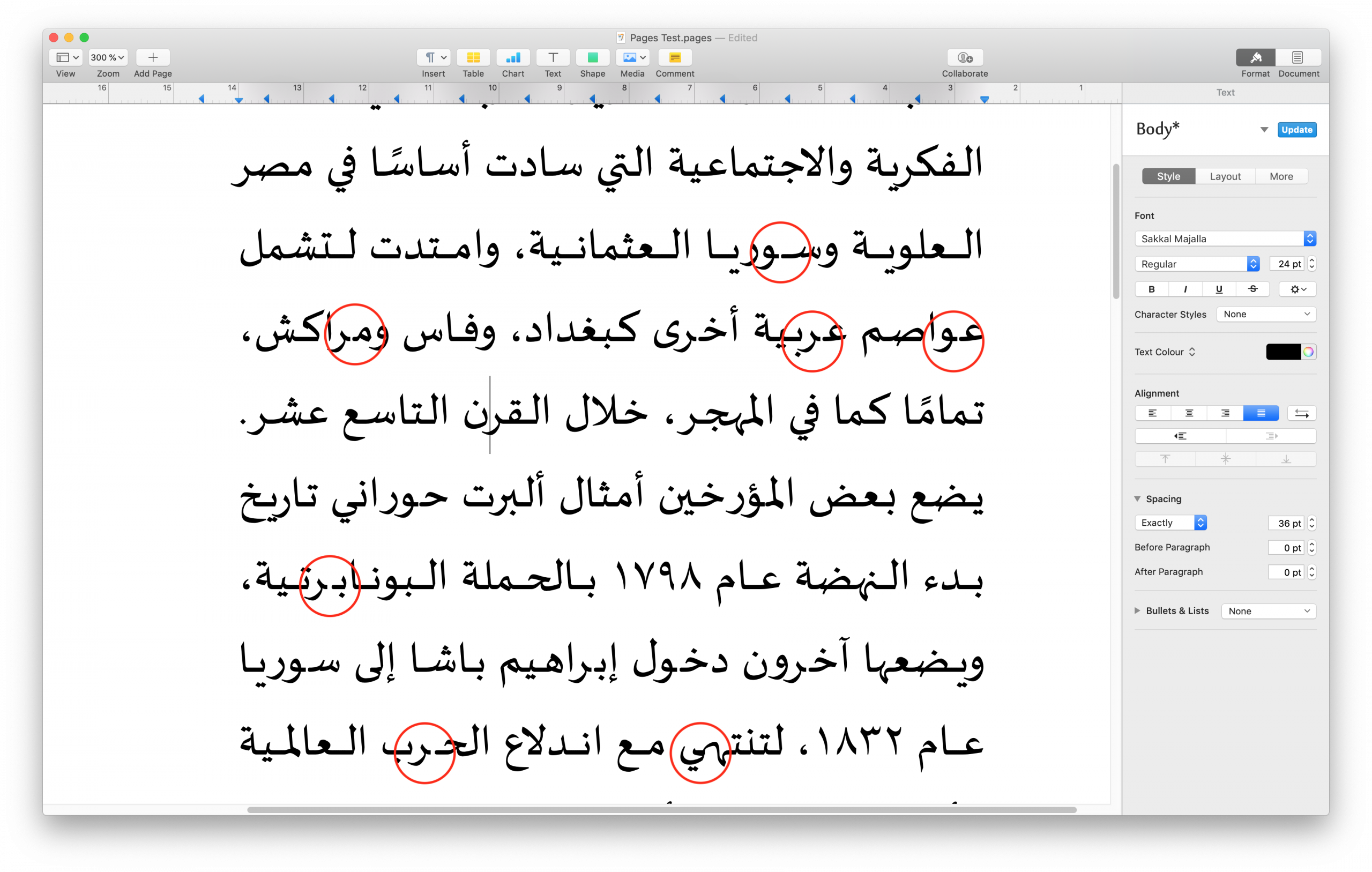
As expected, Pages performs better with Apple’s AAT fonts. Indeed, using taking advantage of AAT’s advanced layout features, Pages comes close to achieving satisfactory Arabic text justification. The tested fonts, Farisi and Waseem, do not provide kashīda elongation between letters (rightly so in the case of Waseem, which follows the Ruq‘ah style), therefore justification is achieved through a combination of glyph variants and modification of white space.13
Unfortunately, even here are problems: the two instances of tanwīn marks break the shaping, and there are some unresolved collisions of glyphs. On a general level, one may question whether justification should be defined in the specification of the font, as is done here. It is easy to imagine use cases in which the user – say a discerning typographer – would want to have some control over the justification methods used. On the other hand, providing a better result for the majority of non-specialist users, as is the case with system fonts, may be a better rationale.
LibreOffice is the only word processor that nominally supports all three font formats, the display of all fonts in the menu is therefore appropriate. Its general typographic parameters are also comparable to the commercial competitors, and so is its Arabic justification strategy. LibreOffice provides no choices about justification parameters, and with OT fonts the results are comparable to those obtained either with the default setting of Pages, or Word’s ‘Justification Low’ option, all of them relying on Tatweel insertion. When using the Graphite-enabled font Scheherazade, justification results appear similar to those obtained with an OT font. In contrast, the Graphite font Awami Nastaliq displays neither Tatweel insertion nor kashīda elongation, relying exclusively on variation of white spaces, demonstrating the format’s potential influence on justification. Conversely, when using an AAT font, shaping only works in ragged-left setting, as justification breaks the text with Tatweel glyphs. LibreOffice therefore only supports AAT fonts partially, and is currently unable to fully take advantage of their features.
Arabic justification on the web
The current support for Arabic justification with OT fonts in browsers is minimal. Across platforms and browser models, only justification through the variation of white spaces is consistently available. Although the OpenType feature ‘Justification Alternates’ can be activated through the font-feature-settings CSS property, its implementation is dysfunctional as all alternates are always activated, rather than selectively used to fill the remaining space of a line.14
Although Graphite and AAT fonts could in principle also be used on the web, they are rarely specified because of lacking cross-platform and browser support. Whilst HarfBuzz is implemented in Firefox, and Apple’s Safari supports AAT fonts natively, it is interesting to observe that in both cases justification relies on variation of white space, as both browsers fail to make use of the shaping rules in the tested font. It follows that not even Apple’s native applications consistently use the potential of AAT, making its scope of use even narrower.
And now for something completely different
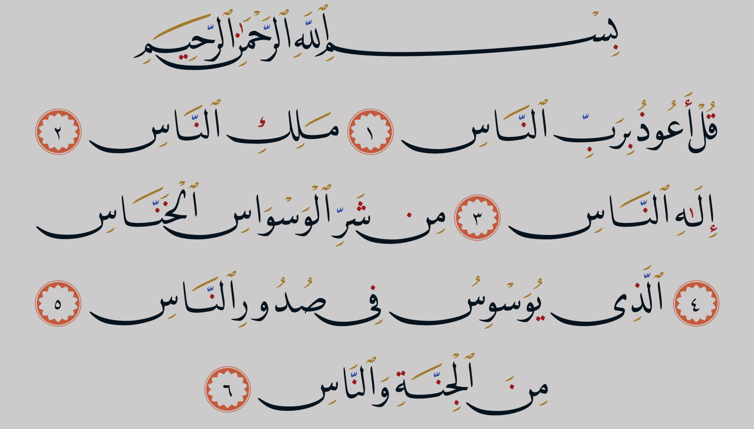
In the context of Arabic typography on the web, a recent project of DecoType merits discussion. In 2017, the Mushaf Muscat was launched, a web-based Qur’ān commissioned by The Ministry of Endowments and Religious Affairs of the Sultanate of Oman. It provides a contemporary interpretation of classical Qur’ān layout for on-screen reading and a range of controls for the display of the text. For example, diacritical marks (ijām) and vocalisation and grammatical marks (tashkīl) of the main Naskh text can be coloured separately; use of either kind of marks can be toggled for the sūra headings that are set in an ‘Abbassīd style typeface;15 and mimicry (‘alāmāt al-ihmāl) of miniature consonants below the main text is provided as an option.
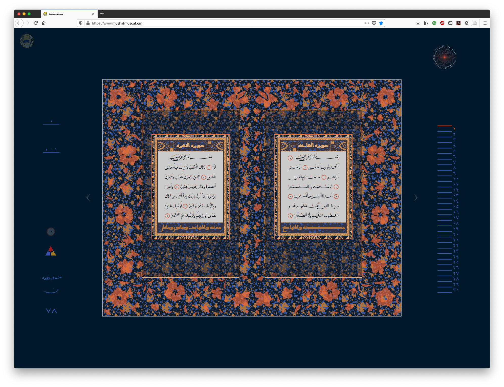
By default, a double page spread and controls are shown, a click into the margin zooms in, hiding the controls, and a further click on a page zooms to an enlarged, single-page view. In this mode, the reader can select words, letter groups, or individual letters, which are highlighted when the cursor hovers over them. Text can be selected and copied, and is fully Unicode compliant. A click on a letter group toggles a new shaping menu that displays all the options in which the selection can be rendered in the DecoType Naskh typeface. Double-click on one of the variants selects it, and updates the display of the text with the chosen form. As the options include numerous swash letterforms, as well as kashida elongation in various lengths, the layout of the page has to react to the user selection. The engine therefore automatically alters shaping and justification options of the surrounding text in order to accommodate the changes in line length. The latter, of course, takes us back to the subject of this post.
The Mushaf Muscat adheres to a predetermined page layout as known from the Medina Mushaf, in which every page ends with a verse number marker. In other words, verses are not allowed to break from one double page spread to the other. Yet the verses of the Qur’ān differ significantly in length, and as the format prescribes which verses fall on which spread, greatly divergent amounts of text have to be made to cover the same area. A central element in the design of this digital Mushaf therefore is a page layout engine that operates within the confines of a double page spread. In order to achieve justified columns of differing text lengths on identical text areas, the algorithm takes advantage of all Arabic justification techniques. It makes full use of the font’s shaping options, including actual kashīda, alternates, and swash variants, and combines them with variation of white space, including use of the margins as a last resort. Moreover, because the displayed text is not static, allowing user interaction, the layout has to be able to adjust dynamically. This last aspect is significant, for it shows that the concepts and technologies at work here could be applicable well beyond the project. So here, finally, we encounter an implementation that combines the shaping functionality of the font with layout algorithms that are appropriate for the script, to successfully use the various justification techniques available in Arabic.
In the introduction I emphasised that computer typography is nothing new, and that some 30 years after its inception one should be able to expect comprehensive support for the main, if not all the writing systems of the world. The Mushaf Muscat is testimony that it is possible to provide the means to practice digital Arabic typography without undue compromises, across platforms, across languages, across styles, and with exemplary standards compliance.16 Finally, in light of the stagnation of support from the leading players, it is noteworthy that whilst the project is the culmination of 35 years of research and pioneering practice of DecoType, the actual making of this project, including the page layout algorithms, only took this small team some two years.
Today, digital Arabic typography could shake off the shackles of redundant technology and legacy practice. The means are there, the expertise and the technology exist, all it takes is the will to implement it for the broadest possible use. In the following post I am looking at historical models of typography, and discuss how evidence of best practice could inform current design strategies and software implementations.
Corrections
An earlier version of this post published on 18 Dec 2019 at 10:34 incorrectly stated that Simon Cozens is affiliated with SIL. He is not.
Appendix
For an overview of the tested justification options you can download this pdf document. The HTML document used to test Arabic justification in browsers can be found here, it is shared under the Attribution 4.0 International (CC BY 4.0) license. Note that the fonts tested are not supplied due to licensing restrictions. To reproduce the tests accurately you will need to have access to the fonts specified in the CSS.
Notes
1 TrueType, one of the key components of OpenType was published thirty years ago, whereas PostScript, the other central component of the format was already on the market in 1984. Greg Hitchcock, involved in the development of TrueType recently wrote: ‘In 1996 we worked with Adobe to create OpenType, which was essentially a rebranding of TrueType, bringing the best of Adobe and Microsoft’s technologies into the TrueType format.’ Hitchcock, ‘Thirty Years of TrueType Fonts’, LinkedIn, 18 September 2019, accessed 18 December 2019. https://www.linkedin.com/pulse/thirty-years-truetype-fonts-greg-hitchcock/
2 The OpenType format theoretically provides some techniques for justification. According to the specification ‘the Justification table (JSTF) provides font developers with additional control over glyph substitution and positioning in justified text. Text-processing clients now have more options to expand or shrink word and glyph spacing so text fills the specified line length’, yet as of now there is not a single rendering engine that supports it. Microsoft Corporation, ‘JSTF — Justification Table – Typography | Microsoft Docs’, last edited 16 August 2018, accessed 18 December 2019. https://docs.microsoft.com/en-gb/typography/opentype/spec/jstf
3 The following publications have considerable overlap: Elyaakoubi, Mohamed & Azzeddine Lazrek, ‘Justify Just or Just Justify’, The Journal of Electronic Publishing Volume 13, Issue 1, Winter 2010, http://dx.doi.org/10.3998/3336451.0013.105; Benatia, Mohamed Jamal Eddine & Mohamed Elyaakoubi & Azzeddine Lazrek, ‘Arabic text justification’, TUGboat, Volume 27, No. 2, Proceedings of the 2006 Annual Meeting, pp. 137–146; Aqil M. Azmi & Abeer Alsaiari, ‘A calligraphic based scheme to justify Arabic text improving readability and comprehension’, Computers in Human Behaviour, 39, 2014, pp. 177–186, http://dx.doi.org/10.1016/j.chb.2014.07.003
4 Hallberg interprets elongation similar to the Tatweel character as a straight extension line that can be inserted between any two joining glyphs. This approach ignores conventional placement, stylistic differentiation, and aesthetic concerns. Uppercase Alif: Andreas Hallberg’s notes on Arabic linguistics, ‘Stretchable kashida and Arabic text justification in LaTeX’, 3 March 2017, last modified 11 December 2018, accessed 18 December 2019, http://andreasmhallberg.github.io/stretchable-kashida/.
5 SIL International, ‘About SIL’, accessed 18 December 2019, http://www.sil.org/
6 SIL International, ‘Graphite – Home’, accessed 18 December 2019, https://scripts.sil.org/cms/scripts/page.php?site_id=projects&item_id=graphite_home
7 Simon Cozens, The SILE Typesetter, accessed 18 December 2019, https://sile-typesetter.org/
8 Adobe Systems Inc., ‘Arabic and Hebrew features in InDesign’, last modified 12 July 2019, accessed 18 December 2019, https://helpx.adobe.com/indesign/using/arabic-hebrew.html
9 The author has sought clarification about these options from Adobe first in February 2017, and again in September 2019, yet did not receive a meaningful answer.
10 Ironically the OpenType specification defines the purpose of the feature in exactly the way that the Arabic font in our test tries to use it: ‘In specified situations, replaces default glyphs with alternate forms which provide better joining behavior. Used in script typefaces which are designed to have some or all of their glyphs join.’ Microsoft Corporation, ‘Registered features, f-j – Typography | Microsoft Docs’, last edited 17 August 2018, accessed 18 December 2019. https://docs.microsoft.com/en-us/typography/opentype/spec/features_fj#jalt
11 Note that Illustrator uses different names for what are presumably the same layout engines: rather than showing an ‘Adobe World-Ready Paragraph Composer’ here we encounter the ‘Middle Eastern Every-Line Composer”.
12 At the time of writing it appears as if Adobe may adopt Harfbuzz more widely, enabling the shaping of Graphite and AAT fonts. However, in Adobe’s current applications Arabic layout of either format does not work yet.
13 Ironically the font Farisi does not feature characters for Persian or Urdu, the languages that make most use of the Nasta‘līq style; and that despite its name, which means ‘Persian’ in Arabic.
14 Microsoft Internet Explorer had an algorithm for Tatweel insertion from version 5.5 (2000), which was also adopted in the Edge browser until its recent change to the Chromium codebase. Documentation for Microsoft’s justification approach can still be accessed here. Incidentally this source also appears to have been used by the developers of OpenOffice (and subsequently LibreOffice) in their implementation. OpenOffice Git Hub repository, openoffice/porlay.cxx, last edited 6 November 2011, accessed 18 December 2019, https://github.com/mirror/openoffice/blob/ac58ea25d9ea6e57181d6047264340cdc75de79a/main/sw/source/core/text/porlay.cxx#L1145
15 All text display options can be saved locally as a .xml file. The interface allows to upload these settings at another time, enabling the re-use and sharing of settings.
16 All the text of the Mushaf Muscat is encoded in Unicode, and can be searched, copied, and pasted without loss of semantics. Representatives of both, the Unicode Consortium and the WC3 commented on the exemplary use of state of the art technology and web standards in this project. See Thomas Milo, “Lecture during the official presentation of Mushaf Muscat (www.mushafmuscat.om)”, YouTube, last edited 7 June 2017, accessed 16 December 2019, https://www.youtube.com/watch?v=UpxsWGxgJIo