Marie Neurath designed science books for children in the mid-20th century, using clever visual techniques to explain scientific ideas. An exhibition about her work at the House of Illustration in London draws upon collections held here at the University of Reading. Here we take a look at some of the innovative techniques Marie Neurath used to communicate science.

Marie Neurath (1898–1986) co-developed with Otto Neurath a simplified pictographic language called Isotype (International System of Typographic Picture Education). After fleeing Vienna in the 1940s she came to London and directed a team of writers and illustrators at the Isotype Institute. There, among other projects, Marie and her team produced visually exciting science books for children, published by Max Parrish until the 1970s.
These included ‘The Wonder World of Nature’, a series of books for seven-to-ten-year-olds published between 1952 and 1962 providing simple explanations of strange things that happen in nature. Another series, ‘Wonders of the modern world’ ambitiously aimed to explain topics from atomic energy to telegraphy and engineering, while the ‘Visual Science’ series (1950–1952) was intended for use in schools, introducing science in a creative and stimulating way for pupils and teachers.
Marie used bold colours and techniques such as magnification and cross sections to explain complex scientific concepts in a simple way, bringing science to life for generations of children.
Up close
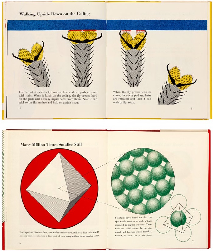
In Too Small to See (1956) we see a magnified view of a fly’s leg, explaining how it is able to walk upside down upon a ceiling, and ‘Inside the atom’ (1956) visualises the internal structure of an atom. Close-ups or microscopic views feature heavily in the Isotype children’s books.
‘The magic knife’
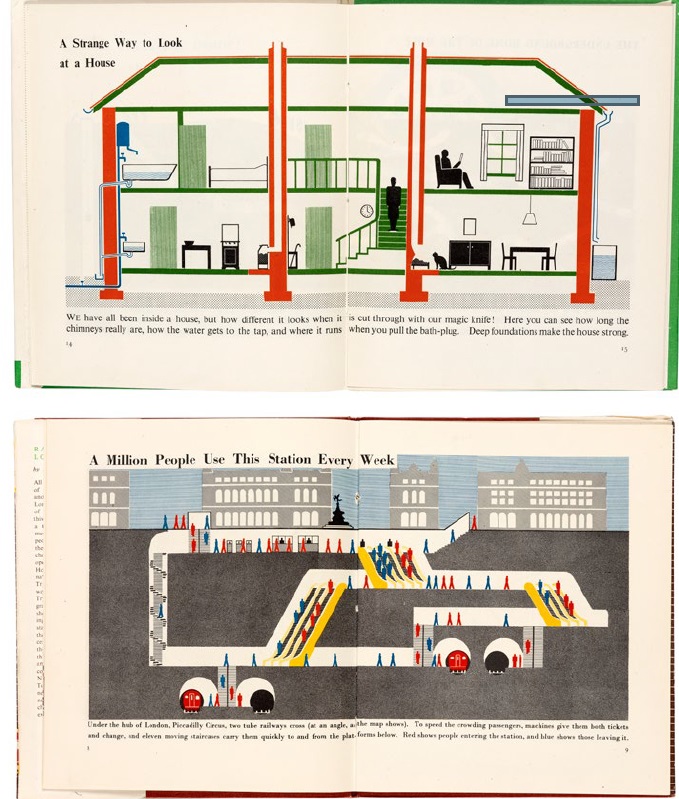
‘The magic knife’ was a term used by Marie in If You Could See Inside (1948) to explain cross section drawings, which give the appearance of cutting through an object, such as a building, to reveal its inner workings. In Railways under London (1948) a cross-section of the London Underground is combined with Isotype pictograms.
Side by side
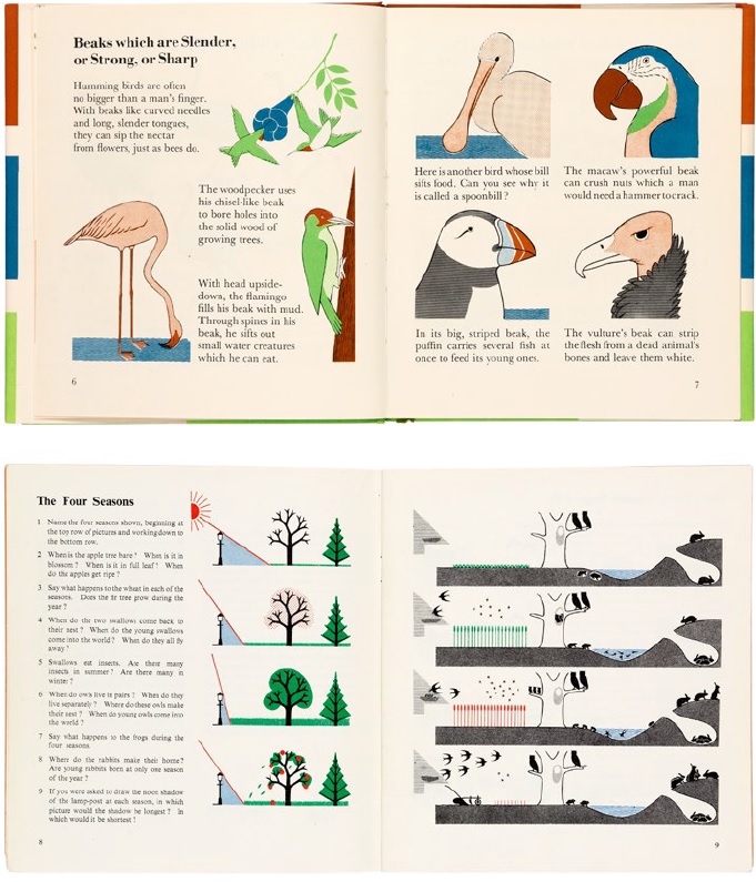
Comparison is used in many of Marie’s illustrations in a variety of ways – from how birds’ beaks shape differs according to the types of food that they eat, to differences across time and space (seasons and climates). These pages are from The Wonder World of Birds (1953) and Visual Science (Book 1) (1950).
Component parts
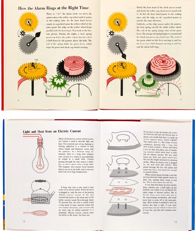
Showing the component parts of a mechanical or engineered object was a technique that Marie used to illustrate complex processes, or the application of sources of power such as electricity. She often used everyday objects – such as the alarm clock, kettle and iron we see here – to encourage children’s engagement with the science behind how they work. These pages feature in Machines Which Seem to Think (1954), top, and What Is Electricity? (1964).
Building up a story
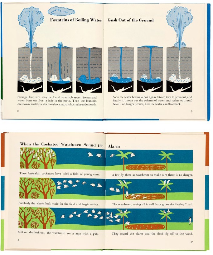
To get across the idea of things happening in sequence, Marie repeated the base image of a drawing to tell a story. The cross-section of the earth from The Wonder World of Land and Water (1957) (top) shows step by step how a geyser is formed, for example. In The Wonder World of Birds (1953), the story of cockatoo watchmen is told against a backdrop of trees, sky, grass and water.
A rich resource for research
The Otto and Marie Neurath Isotype Collection was given to the University of Reading by Marie Neurath in 1971. It is the most comprehensive archive of the work of the Isotype movement, including documents, letters, published books, and artefact relating to the working methods and principles of the movement from its beginnings in 1920s Vienna.
The collection is a treasure trove for researchers interested in social history, graphic design of data, science communication, inter-War modernism, the history of information design, and campaigns and initiatives that address social and economic planning, public health, housing, and other dimensions of life.
The exhibition ‘Marie Neurath: Picturing Science’ runs until 3 November 2019 at the House of Illustration in London and is part of an AHRC-funded project led by Sue Walker and Eric Kindel from the University of Reading’s Department of Typography & Graphic Communication. The exhibition is co-curated by the project team at Reading and project partners House of Illustration and Design Science.