Introduction
In previous posts of this series (1) (2), I have revisited a short history of typographic justification of Arabic, and evaluated the provisions that are found in current software implementations. The latter was particularly sobering, as I came to the conclusion that some 35 years after the beginning of personal computing, contemporary mainstream software provides no adequate means to achieve correctly justified Arabic typography – one of the most fundamental configurations of a block of text. In this post I want to look at some of the evidence for Arabic justification from historical models. A central premise of this research project lays in using exemplary precedents to inform current practice. The word exemplary has to be emphasised here, for not any historical example carries the same relevance for contemporary use. As I explained in the opening post of this blog, TypoArabic is concerned with Arabic typography from an era that was identified as a formative moment in its history. In the second half of the nineteenth century Arabic typography flourished for the first time in the Middle East, leaving behind 400 years of indifference to this technology by native users of the script. It was here, when craftspeople with the relevant cultural competence embraced typography and type-making, that the medium of letterpress printing was given a form that was generally accepted by the intended audience.
This was a seismic change if we compare it to the failure of Arabic typography from Europe to make any inroads to the Middle East in the preceding centuries. In contrast to all attempts at making Arabic letterpress printed books from Italy, Central Europe, the Low Countries, France, or Britain – which left Middle Eastern readers unimpressed – the publications that emerged in the region in the nineteenth century elicited a response. Indeed, once punch cutters, type founders and printers in Istanbul, Beirut, or Cairo began making books using their own, locally produced foundry type, and used it with sensitivity to the conventions of document design that were established in the region, a print and publishing revolution was set off. Arabic typography was thus given a shape that held up next to the exceptional Ottoman manuscript culture of the nineteenth century, demonstrating its unprecedented quality. For the first time the medium of typography was used to successfully represent the Arabic script for native readers, and thus established its archetypal form using movable type. Yet, as the twentieth century brought renewed technological change, the foundations of Arabic typography were eroded. Typesetting machinery did not allow to maintain the norms that had emerged in Middle Eastern print shops, and little of the achievements of the pioneers of the craft survived to our days.[1] With this understanding, TypoArabic explores the legacy of this first high point of Arabic typography. The artefacts that I am looking at were produced under circumstances that lent them qualities which transcend time, and may therefore inform how our craft is practised today.
Justification in historical foundry type models
Justified typesetting was the norm for Arabic typography in the nineteenth century. Without exception, all volumes that I have reviewed thus far, including works of grammar, literature, poetry, history, rhetoric, etc, from more than 18 different print shops from Beirut, Cairo, and Istanbul, were fully justified. This pattern is consistent irrespective of the number of columns, the type size, or language. This, of course, is not very surprising, as justified text columns were also the dominant form of textual configuration in manuscripts. In handwriting, a range of methods for the filling of a line evolved, and palaeographers even consider the reduction of size and the stacking of words and letters above each amongst these techniques.[2] The systematic, and often more rigid features of typographic composition limited these means, for better or worse, to two: (1) the variation of letterforms, principally through elongation and alternative, swash letterforms, and (2) the variation of white space. As discussed in part one of the series, typographic composition sometimes resorted to using the straight Tatweel bar to imitate elongation. Yet, when letterpress printing flourished in the Middle East, this technique was used sparingly, and only under certain conditions.
In the following discussion I show different examples of typographic justification from print shops in the three publishing centres of this research: Beirut, Cairo, and Istanbul. I consider the different genres, the kinds of texts and books, the layout, the typefaces used, and the strategies that are used to achieve equal line lengths across the columns.
Tuhfe-i Vehbi, 1798, Istanbul
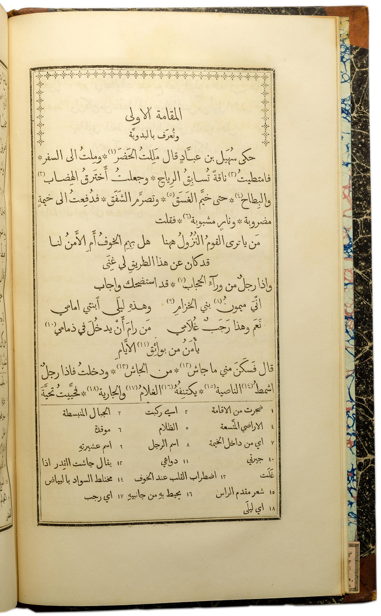
The first volume is a Persian-Ottoman Turkish dictionary that was printed as early as 1798 at the Dār al-Ma‘mūra, the Imperial print shop of the Ottoman capital Istanbul. It forms part of a genre of rhyming dictionaries that were used in the Middle East in the teaching of foreign languages. Based on a corpus of words usually taken from a classical work, these dictionaries combined verses with glosses explaining the new words to pupils and students. The Tuhfe-i Vehbi became particularly popular and this volume was reprinted more than 50 times in the ten years after its first publication in 1798.[3]
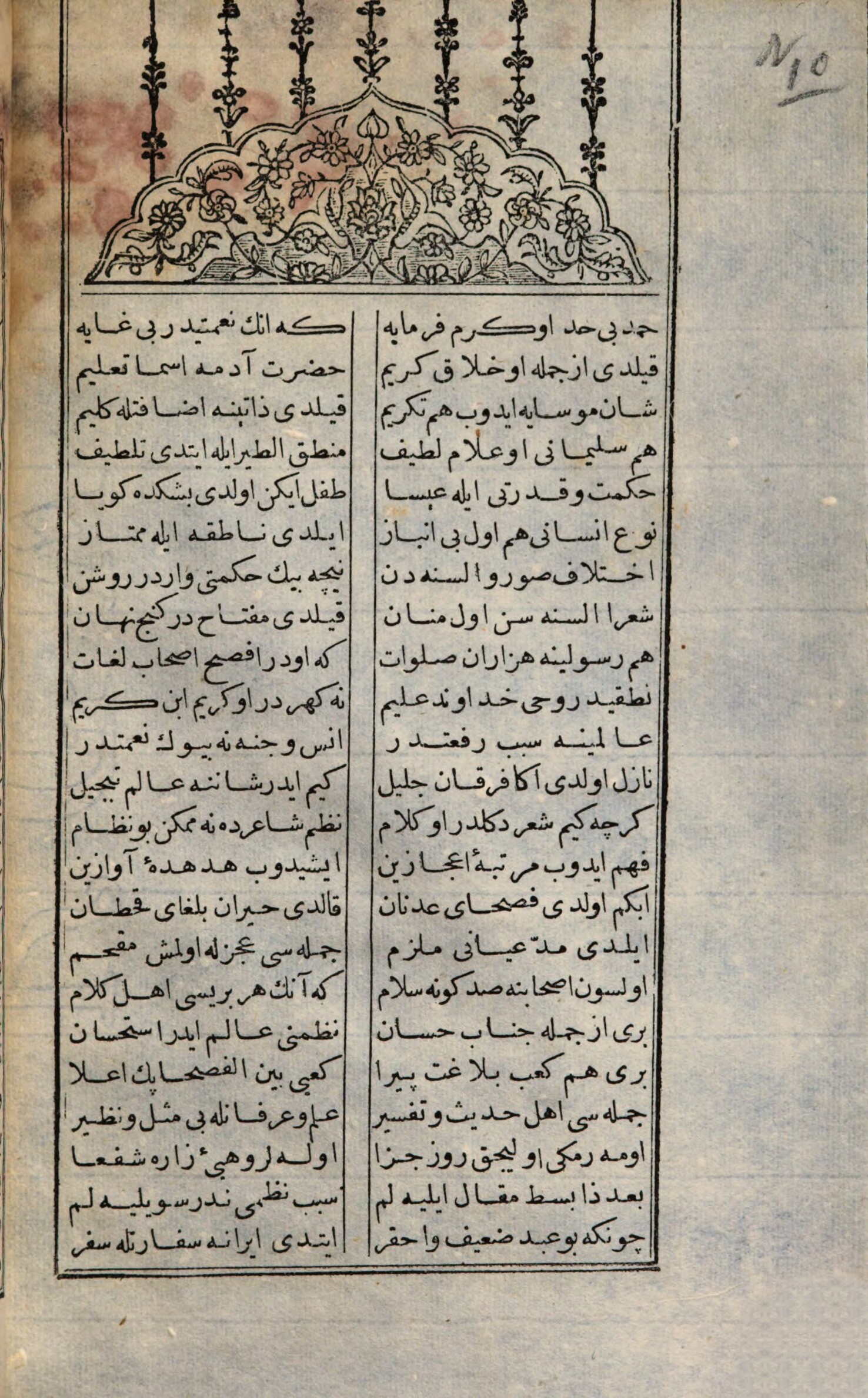
This mid-sized (128mm × 255mm) volume is well printed and demonstrates high production standards: The type is mostly clear and only slightly impressed, inking is even, and register is within expected tolerances, demonstrating a high level of craftsmanship. The text area is delimited by a double rule border, and alternates between a one column and a two column layout, the latter separated by two vertical rules. The book is composed from a single size fount of Poghos Arapian’s 16pt Naskh typeface[4], cut in 1791. Section headers are centred, and enclosed by horizontal rules above and below, creating structure and hierarchy with minimal means.
Whereas some of the verses are set in the most conventional layout seen above – setting one couplet per line in two, justified columns – others follow another configuration that can be found in manuscript practice. Here the two parts of the couplet are set in two consecutive lines, with the first part right-aligned, and the second part left-aligned, both justified to approximately the same width. Thus, the two parts of a couplet have some horizontal overlap each, with the result that a third ‘column’ emerges in the middle of the text area.[5]
Turning to justification, despite the narrow columns a relatively even distribution of spaces is readily apparent throughout the volume. The typesetter thus modified white spaces as little as possible, and seemingly only as a last resort. Lines were justified either through selection of swash variants of letterforms, or the insertion of Tatweel sorts. However, looking through the volume, as well as other books composed from the same fount, a few sorts appear particularly frequently. Especially the elongated forms of the Kaf stand out, but also a final Alif sort with an extended connecting stroke, the returned Yeh, as well as the wide, curved form of final Reh are frequently used. Most lines that feature a Kaf and require justification seem to be set with the swash variant, rather than a Tatweel, suggesting a preference by the compositor. Similarly, when a final Reh may be set with its round alternate this sort is often used, limiting Tatweel mainly to those lines that do not feature any of the letters for which the fount provides wider alternates.
Examples that do not fall into this pattern can of course be found in this volume, and the factors influencing the choice of sort by the compositor are too numerous to be reconstructed by induction alone.[6] Yet there appears to be enough of a tendency of using elongated alternates, rather than Tatweel, from which we can infer that if the fount had contained more variant sorts, they would have been used by the typesetter.
Kitāb Majma‘ al-Bahrayn, 1856, Beirut
The second case takes us half a century ahead, into the emerging centre of Middle Eastern publishing: Beirut. Here the American Mission Press, set up by the American Board of Commissioners for Foreign Missions in 1834, had established itself as a key conduit for the advancement of local publishing activities. Since 1841, when George C. Hurter became the first trained printer to assume this role at the mission, and a new set of founts began to be used that came to be known as the ‘American Arabic’ typeface, the Press became a central institution of the regional print culture.[7] Not only did it produce the Mission’s own publications, but it also provided the service of a regular print shop to aspiring publishers and authors, and distributed printing hardware throughout the region.
The Kitāb Majma‘ al-Bahrayn is a typical publication of this period and place. Published in 1856 without any imprint other than that of the patron Nakhla al-Mudawwar, it is readily recognisable as a publication from the American Mission Press. Its medium format (144 × 243), the quality of printing, the typography in two sizes of the American Arabic typeface, and editorial decisions such as the use of footnotes make the Kitāb Majma‘ al-Bahrayn an exemplary production of this printing house. The text itself is also a typical example for the emerging print culture, and the cultural movement of the Nahḍa. Written by Nāṣīf al-Yāzijī, the Kitāb Majma‘ al-Bahrayn is a collection of fifty stories that reference the style of al-Harīrī’s 11th century Maqāmāt, a key work of the Arabic literary tradition.
The typography of this volume is defined by the American Arabic typeface, used here in three sizes. The main text is set in the 24pt fount, and footnotes and subheadings are set in the 20pt fount. The section headers are centred, and set from a 32pt fount that is loosely inspired by the Thuluth style, making it one of the first uses of this size.[8] The main prose is fully justified and interspersed with verse couplets which are either set in a two column configuration, or off-set over two lines, as in the Tuhfe-i Vehbi discussed above. The book is marked by the vast number of notes that accompany the text, and as a consequence the footnotes take up a significant part of every page. They are set flush right in three columns, yet the layout adapts to longer notes, which are set across the full measure of the main column, demonstrating what was possible in letterpress typography.
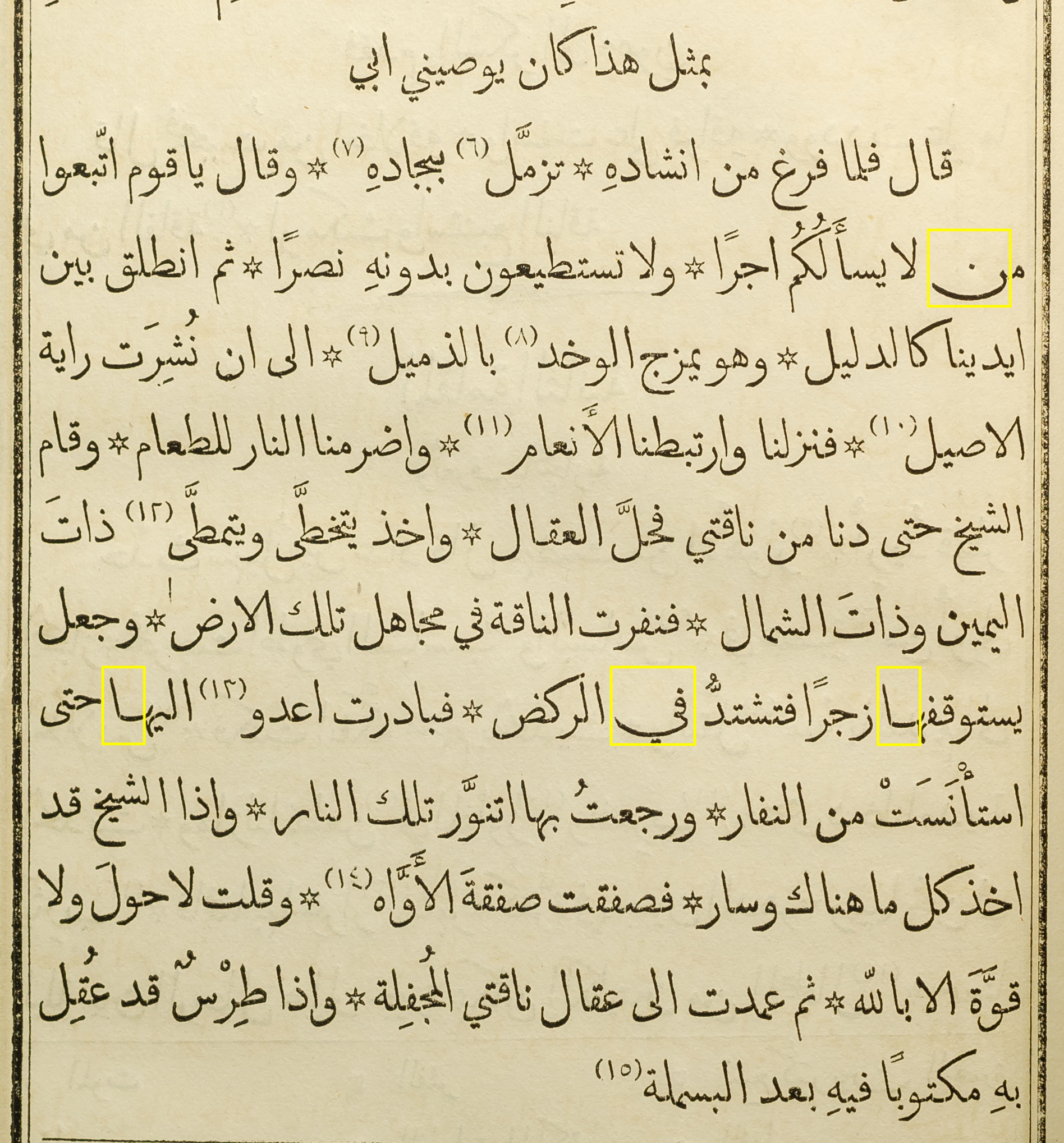
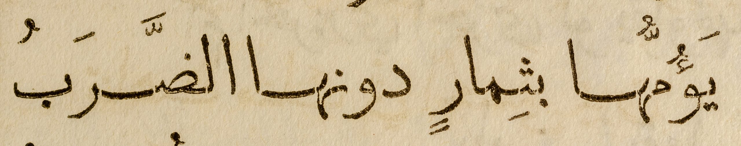
Indeed, the justification is testimony to the typographic quality that could be achieved by a competent printer with a quality Arabic metal fount. Depending on the context, individual methods or a combination of techniques are used to justify lines, namely the variation of white space, the use of swash variants, or the use of elongations. However, rather than straight Tatweel sorts, curved Kashida are combined with dedicated alternate sorts to give the impression of smooth, curvilinear connections.[9]
Through the combination of these means, a typical text page requires few apparent ‘interventions’ to achieve justification and an even distribution of spaces. A page that has been justified with these combined techniques appears inconspicuous, almost as if lines were of similar lengths by default, rather than active modification – a mark of successful justification.
When we look at the verses, the interventions necessary to achieve equal line lengths become more apparent, owing to the narrow columns. Here more swash sorts and more Kashida had to be employed, lending the verses a different appearance than the prose – an effect that corresponds to manuscript practice, and may even have been desired from a semantic design perspective. Furthermore, the variation of white spaces was handled more freely. There is a clear preference for visibly extended word spaces over the use of Kashida, and in some cases column width and alignment are allowed to vary as verses are wider or narrower.
Ilīadhah Hūmīrūs, 1904, Cairo
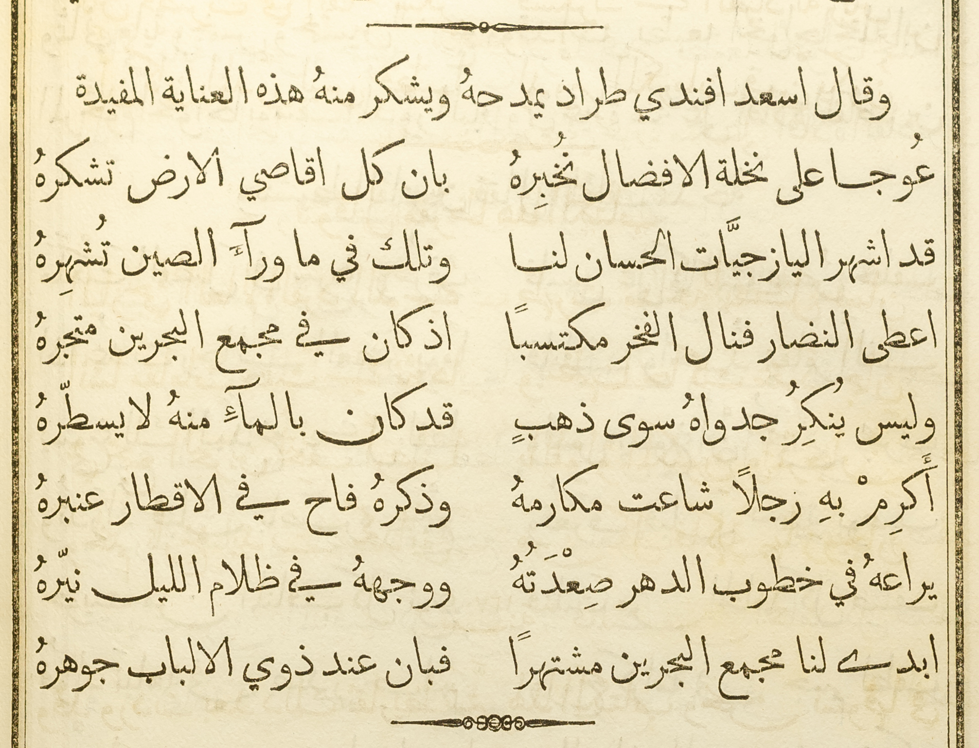
The final example takes another leap in time and space to early twentieth century Cairo, where the second generation of intellectuals that defined the Nahḍa continued the work of literary renewal and language reform. Sulaiman al-Bustāni’s (1856–1925) edition of Homer’s Iliad was celebrated upon its publication, and is still regarded as a key work of comparative literature in Arabic.[10] The monumental volume was the result of 17 years of engagement with the subject, and it includes an extensive introduction that repositioned the text for an Arabophone audience, and a critical, annotated translation of the verses into Arabic. Born in 1856 in Lebanon, Sulaiman al-Bustāni was a nephew of the renowned Butrus al-Bustāni (1819–83), who had been a key influence at the aforementioned American Mission Press. Later Sulaiman contributed to his uncle’s encyclopaedia Da’irat al-ma‘arif, worked on early Lebanese newspapers, and became a successful Ottoman dignitary. His edition of the Iliad was published at Jurjī Zaydān’s al-Hilāl press in Cairo, in an exemplary convergence of diverse strands of the Nahḍa.
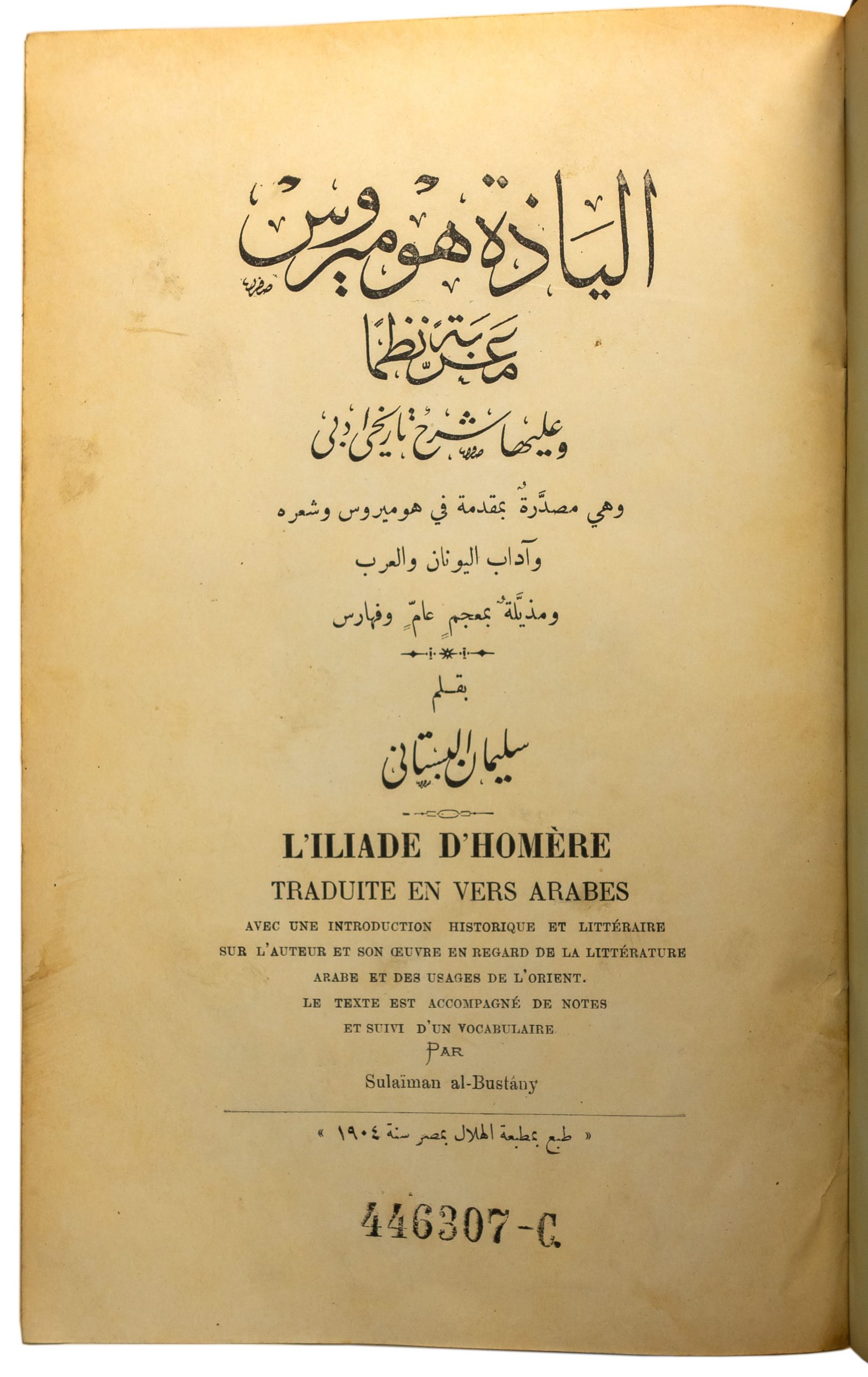
Just like Sulaiman al-Bustāni’s oeuvre built on the work of the preceding generation of writers, so did the printed works of his era benefit from the pioneering work of the previous decades. Whereas the typesetters who worked in Istanbul on the Tuhfe-i Vehbi had only a single typeface, in one size, the printers at al-Hilāl could choose from a range of types, in numerous sizes and styles. Moreover, they could tap into a vastly expanded repertoire of typographic forms, paper stocks, printing plant, and skilled craftspeople. Indeed, the leap that the trade had made over the preceding century is apparent when opening al-Bustāni’s Ilīadhah Hūmīrūs. It is a monumental tome of some 1260 pages, neatly printed on firm, coated paper. The title page is adorned with a large, calligraphic title piece, a typeset description of the contents, a calligraphic rendition of the author’s name, and a translation into French. In total five different founts are used on this page alone. It is followed by a frontispiece featuring a half-tone reproduction of a photograph of al-Bustāni, showing the fast adaptation of new printing technology in the region.[11]
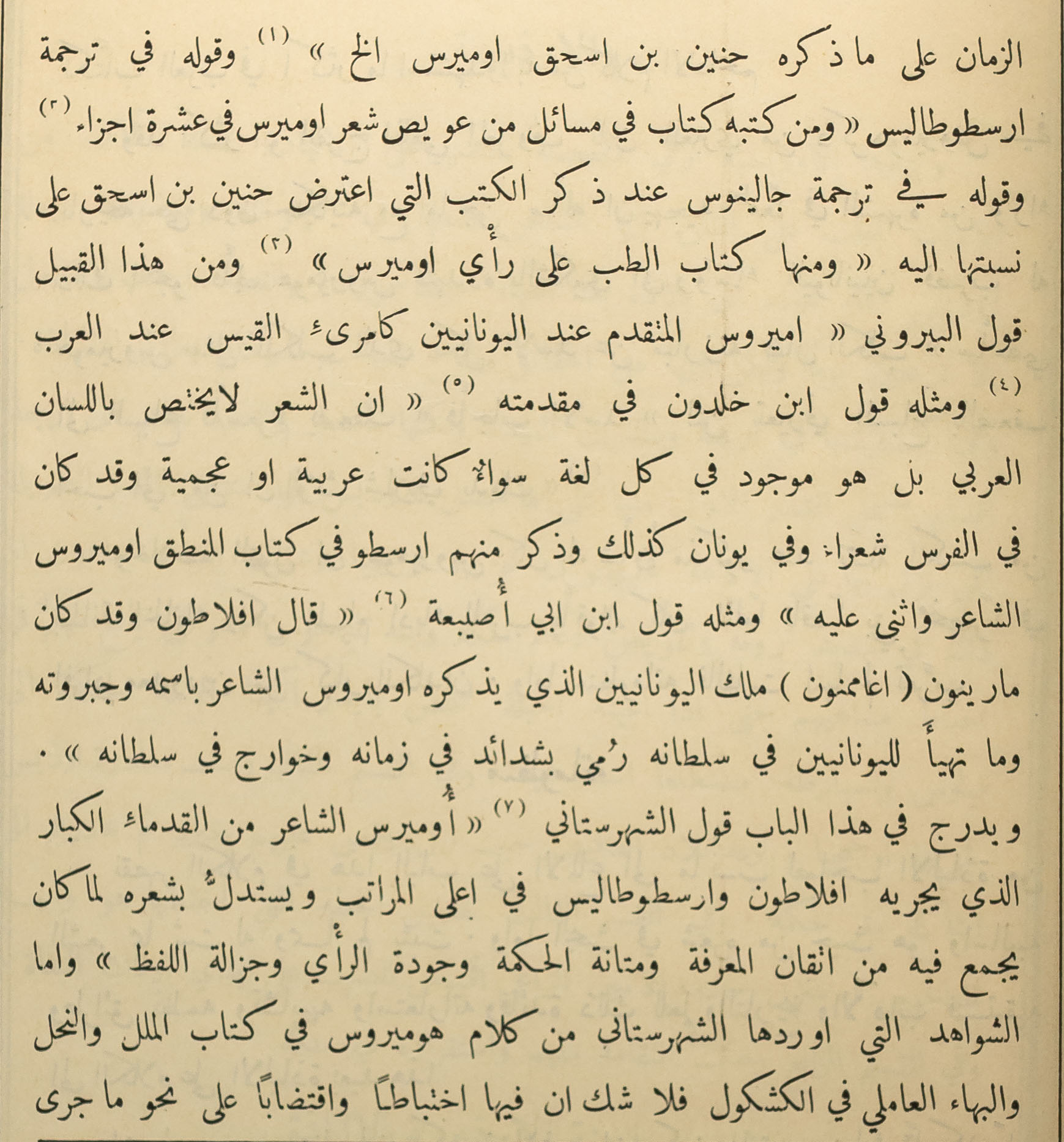
Al-Bustāni’s Ilīadhah Hūmīrūs encompasses diverse kinds of texts, from the historical background notes, to an analytical contextualisation within Arabic literary tradition, and the actual translation of the Greek verses with accompanying critical notes. The volume’s typography reflects this, as the compositor used different configurations and founts to visually distinguish textual qualities. The body of the main texts is set from two different sizes of founts that originated from Ohannes Mühendisyan.[11] Prelude and the historical sketch of the introduction are set as one column, whereas the translation is set in the typical double column configuration of two verse couplets per line.

However, irrespective of the type used and the width of the column, overall the text is composed loosely, with a predominance of enlarged white spaces. Although some swash variants can be found, the founts used appear severely reduced in characterset when compared to earlier publications by Mühendisyan, which feature a wider range of variants. Justification is therefore primarily achieved through the increase of white space, with unfavourable consequences for the cohesion of lines.
The verse setting in two narrow columns is most demanding for justification, and illustrates some of the results most starkly. Here spaces are often as wide as short words, and the typesetter did not feel the need to counter this through the insertion of Tatweel sorts. There are cases where elongations are used, but they are not consistent, and numerous lines which could have been justified with swash variants were set with the default sorts. However most striking is that sometimes letterblocks are broken across the column gutter. Contrary to manuscript practice, and in what appears like a solution that was driven by technological limitation, letters which ought to be joined are separated by white spaces.
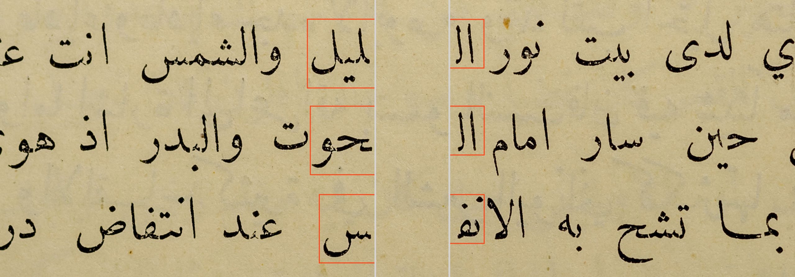
Until further evidence and a meaningful rationale for this technique is found, it appears like a ‘typographism’ in which the means unduly prescribed how the text could be represented in print. Furthermore, that this case is found in the youngest publication may be indicative of wider trends. Whereas the earliest printers in the Middle East adhered more strictly to established conventions, by the twentieth century the inherent logic of the medium, including its technical and economical limitations may have eroded standards from manuscript practice, and opened the door to a dynamic that was accelerated a few years later by the onset of mechanisation.
Some patterns
From the volumes that I have been able to review thus far, with a small selection presented here, some patterns of justification principles seem to emerge. Most generally speaking, it appears as if typographic compositors in the nineteenth century Middle East sought to reproduce manuscript practice as closely as their medium allowed. In most instances, the full extent of compositional possibilities of a given fount were used. This means that most of the time no corners were cut, and that typesetter aspired to achieve the best possible justification with the means at their disposal, even if it required more time and effort. Thus, if swash variants existed in a fount, they were used for justification; if elongated variants of letterforms existed, they were used for justification; and if Kashida were part of the type’s design, they were used too. Strikingly, however, Tatweel bars were used sparingly, and often the modification of white space was chosen rather than Tatweel justification. And in the instances in which Tatweel sorts were used, they were almost exclusively inserted in permitted locations.[13]
Incidentally, as the example of the Iliad may show, standards, expectations, and techniques evolved as typographic print spread, and became established throughout the region. Norms that may have been inviolable in the 1850s were worn down by the dual-tendency towards efficiency increases and modularisation, which are inherent in typography. Thus, even though the compositors at al-Hilāl had much better and more diverse tools than their forebears, other factors such as economic pressures, Western influences, or loss of cultural competence may explain that the resulting typography was inferior.
Some conclusions and recommendations
The patterns that can be observed in practice from this golden age of Arabic typography suggest some preliminary conclusions, and although this research has not even reached its half-time mark, some tentative recommendations may already be articulated. The following suggestions are intended for developers of any kind of text processing software for the Arabic script, and may also be useful to students and practitioners of Arabic typography.
- the common perception that Arabic justification is achieved primarily by means of Tatweel is an ill-informed remnant of now-obsolete typographic technology: Tatweel or flat Kashida should only be used as a last resort
- Arabic justification combines multiple techniques for best results, namely (1) the variation of white space, (2) the use of swash variants, and (3) curvilinear elongation with Kashida
- Variation of white space is preferable over excessive elongation of words
- Algorithmic insertion of Kashida and/or Tatweel should be based on attested elongation rules that depend on the writing style on which the font is based
- Search functions of applications should ignore the Tatweel character U+0640 when returning results
- The Unicode consortium should deprecate the Tatweel character
Acknowledgements
I would like to thank Onur Yazıcıgil and Borna Izadpanah for their helpful advice on a few of the details of the discussed editions.
Notes
[1] See my Arabic Type-Making in the Machine Age: The Influence of Technology on the Form of Arabic Type, Boston ⸱ Leiden: Brill, 2017.
[2] Gacek, Adam, Arabic Manuscripts: A Vademecum for Readers, Leiden ⸱ Boston: Brill, 2009, 146.
[3] Inan, Murat Umut, ‘Imperial Ambitions, Mystical Aspirations: Persian Learning in the Ottoman World’, in Green, Nile (ed.), The Persianate World: The Frontiers of a Eurasian Lingua Franca, University of California Press, 2019, p.88.
[4] For a discussion of Arapian and his works see Conidi, Emanuela, ‘Arabic Types in Europe and the Middle East, 1514–1924: Challenges in the Adaptation of the Arabic Script from Written to Printed Form’, PhD thesis, University of Reading, UK, 2018, pp.573–581.
[5] Whereas this configuration has a precedent in manuscript practice, it may also reflect the constraints of letterpress printing. If some couplets were too wide to fit next to each other within the same line, this configuration may reflect the search of a workable model from manuscript practice within the physical confines of foundry type.
[6] We cannot know when and why the compositor decided to keep a word on the line, or push it to the next line; we cannot know whether all the sorts were always available; we have no way of knowing which of the choices were owed to preference, circumstance, or happenstance, such as the convenience of the typesetter or his urge to finish a line before having a break or going home to see his family.
[7] Glass, Dagmar, Malta, Beirut, Leipzig and Beirut Again: Eli Smith, the American Syria Mission and the Spread of Arabic Typography in 19th Century Lebanon, Beirut: Orient-Institut der Deutschen Morgenländischen Gesellschaft, 1998, p.24.
[8] According to J. F. Coakley, the 32pt fount was only used after 1856. ‘Homan Hallock, Punchcutter’, Printing History 45. The Journal of the American Printing History Association 23, no. 1 (2003): pp.18–41.
[9] I am using Kashida deliberately in the singular (instead of Kashidas) to emphasise the difference to Tatweels: Whereas Tatweels – modular, symmetrical typeforms similar to dashes – lend themselves to random repetition, Kashida are elongations that are highly contextual and may therefore not be repeated or combined arbitrarily.
[10] Noorani, Yaseen, ‘Translating World Literature into Arabic and Arabic into World Literature: Sulayman al-Bustani’s al-Ilyadha and Ruhi al-Khalidi’s Arabic Rendition of Victor Hugo’, in Booth, Marilyn (ed.) Migrating Texts: Circulating Translations around the Ottoman Mediterranean, Edinburgh University Press, 2019, p.237.
[11] According to Michael Twyman, halftone reproductions had only become current in the UK during the 1890s, demonstrating that the Middle Eastern publishing sector had all but caught up with the most advanced industrial countries in the early twentieth century. Printing 1770–1970: an illustrated history of its development and uses in England, London: Eyre & Spottiswoode, 1970, p.32.
[12] Note that individual sorts appear to belong to different founts, as I have been able to spot some instances of American Arabic.
[13] Thomas Milo has been popularising the term ‘script grammar’ to describe the rules that govern the shaping principles in Arabic manuscript practice.