Climate scientist Ed Hawkins has made a big difference to the understanding of a vital contemporary issue: the upward spiralling of global temperatures.
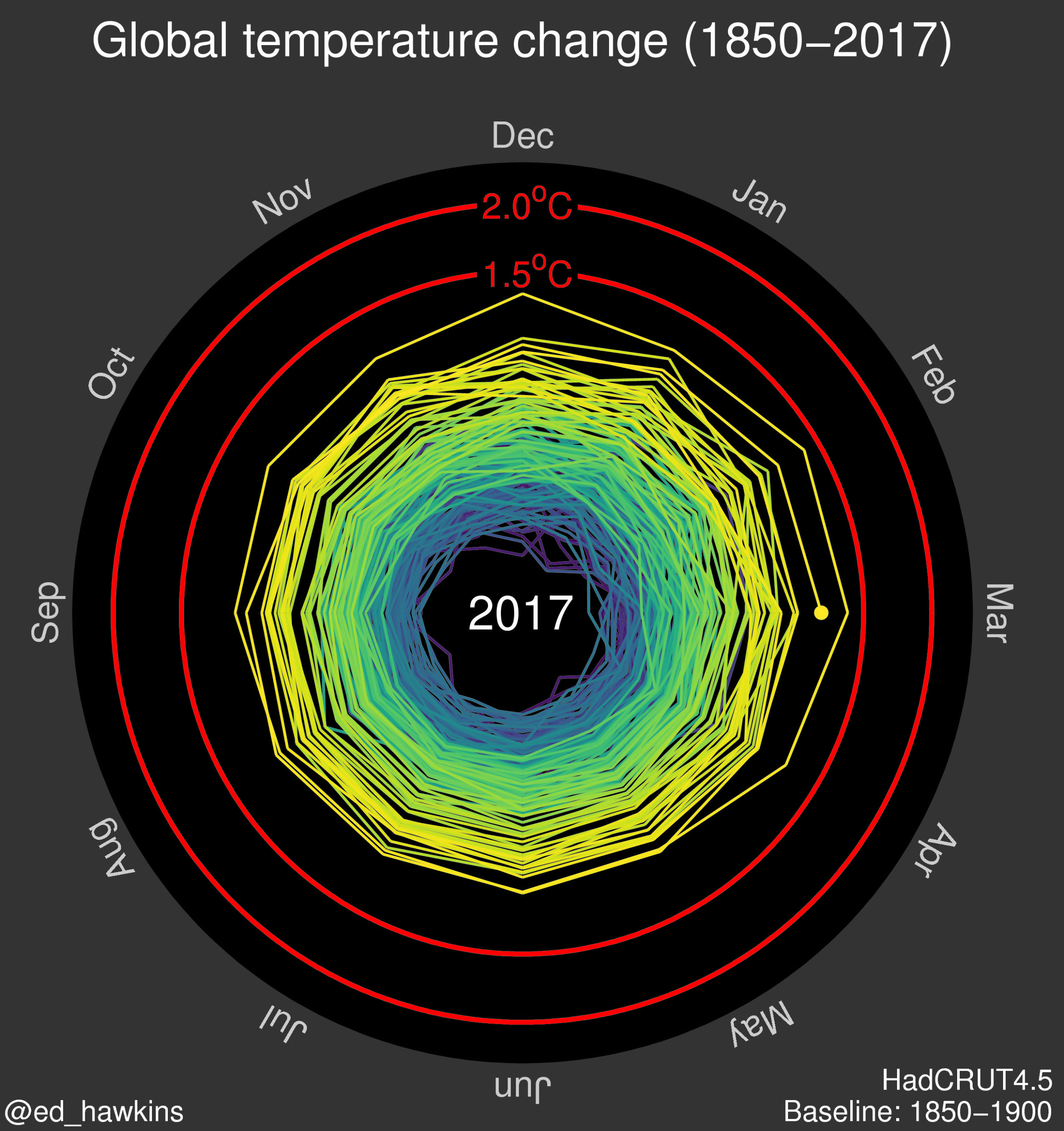
Dr Hawkins analysed the past 165 years of global average temperatures and created what Mashable described as ‘the most compelling climate change visualisation ever seen’. Dr Hawkins’ animated climate spiral was first published on his blog Climate Lab Book, then via Twitter, where it was picked up and discussed by leading commentators around the world. It went on to form an integral part of the opening ceremony of the Rio Olympics, where it was seen by a TV audience of more than a billion people.
The Climate Lab Book, a blog Dr Hawkins writes as part of his research activities, was already popular, thanks to its accessibility and engagement with scientists and members of the public, but its popularity grew exponentially thanks to the climate spiral. The animation has been seen 3.4 million times from Dr Hawkins’ tweet alone, with many millions more views via social media. Mainstream media were quick to discuss the graphic, while others who have used or mentioned the graphic include Elon Musk, Bernie Sanders and the artist Banksy. The US State Department translated the graphic into several different languages for its online webpages, and it has been used in high-profile conference presentations by senior policymakers, including the Australian Chief Scientist and the Chief Scientific Advisor
for DEFRA.
Shortlisted for the University Research Engagement and Impact Awards 2017
First published: June 2017